
Buying a monitor for photo editing feels a lot like reading the back of a memory card package: numbers everywhere, most of them meaningless without context, and manufacturers betting you won't ask follow-up questions. The difference is that a memory card mistake costs you convenience, while a monitor mistake costs you accurate color judgment on every image you edit. Here's what you need to know.
That spec sheet promising "99% DCI-P3" and "Delta E under 2" sounds impressive until you realize those numbers might be measured under conditions nothing like your actual workflow. This guide breaks down what each specification actually measures, when it genuinely matters for photographers, and how to make an informed purchase without falling for marketing theater.
Understanding Color Gamut: What Your Monitor Can Actually Display
The term "gamut" refers to the total range of colors a display can reproduce. Think of it as a boundary: everything inside that boundary is visible on your screen, and everything outside simply cannot be shown accurately. Different color spaces define different boundaries, and manufacturers love to advertise large numbers for whichever space makes their panel look most impressive.
The sRGB color space remains the foundation of web delivery, client galleries, and general consumer viewing. When a manufacturer claims near-full sRGB coverage, that should be considered the absolute minimum for photo work, not a selling point. The problem is that marketing departments measure these numbers under optimized conditions, and third-party reviews often reveal that advertised coverage falls short in practice. Treat any manufacturer claim as optimistic and verify with independent measurements from trusted reviewers before committing serious money.
Adobe RGB extends the sRGB boundary primarily in cyan and green regions. The common misconception is that printers "use" Adobe RGB, which is not quite accurate. What matters is that certain printable colors, particularly saturated cyans and greens, fall outside the sRGB boundary. If you soft-proof regularly and print your work, a display with strong Adobe RGB coverage lets you actually see and control those colors during editing. If you exclusively deliver to web and social platforms, Adobe RGB coverage becomes significantly less critical.
DCI-P3 appears frequently in monitor specifications, but the terminology requires careful parsing. Consumer devices typically use Display P3, which shares DCI-P3's color primaries but pairs them with a D65 white point and sRGB-like gamma (approximately 2.2). True DCI-P3 is a cinema specification with a different white point and 2.6 gamma curve that crushes shadows significantly compared to standard computer content. Meanwhile, mainstream SDR streaming delivery uses Rec. 709, while HDR streaming typically uses a Rec. 2020 container (with content often mastered within a P3 subset). P3 is common in mastering and display specifications, but it is not the primary distribution target for most content. For photographers whose work stays in the stills world, P3 coverage is nice but should not be the primary purchasing criterion. More importantly, "99% DCI-P3" and "99% Adobe RGB" are not equivalent claims since these are differently shaped color volumes that overlap imperfectly. A display might hit 99% of one space while covering only 85% of another.
The sRGB clamp problem deserves special attention. Wide gamut monitors without a well-implemented sRGB emulation mode make non-color-managed content look radioactively oversaturated. If you work exclusively in properly color-managed software (Lightroom, Photoshop, Capture One) with a correct monitor profile, a wide gamut display does not inherently cause you to over-saturate your exports; the color management pipeline handles the conversion correctly. The problem arises with everything outside that pipeline: some image viewers, certain browser configurations, and various system elements display content without color management, showing it in the wide gamut without conversion. macOS tends to provide more consistent system-level wide gamut handling through ColorSync integration, while Windows still has more places where content is effectively treated as unmanaged sRGB. Regardless of platform, an accurate sRGB emulation mode lets you preview how images will appear on typical consumer displays and helps you catch problems before delivery. Look for displays with an sRGB mode that does not crush tones or lock brightness at an unusable level.
Delta E Demystified: What Color Accuracy Numbers Actually Tell You
Delta E measures the mathematical distance between the color your monitor displays and the color it should display. A Delta E of zero means perfect accuracy, and the number increases as deviation grows. The catch is that multiple formulas exist for calculating this distance, and not all Delta E claims are created equal.
The older CIE76 formula treats the color space uniformly, but human vision does not perceive all color differences equally. A deviation in yellow looks different from an identical mathematical deviation in blue. The newer dE2000 formula accounts for perceptual non-uniformity and produces numbers that better correlate with what your eyes actually notice. Most reputable reviewers now use dE2000, but manufacturers sometimes cite whichever formula produces the smaller number. When evaluating Delta E claims, confirm the formula being used.
The common rule of thumb suggests that average dE2000 under 2 represents "good" accuracy, with values under 1 considered excellent. However, the average obscures important details. A monitor might achieve an impressive average by being nearly perfect across most colors while showing significant error in specific regions that matter for your work, like skin tones or neutral grays. The maximum Delta E (the worst single measurement) often reveals more about real-world editing accuracy than the flattering average. Reviews that test grayscale accuracy, skin tone patches, and saturated colors separately provide more actionable information than a single average number.
A Delta E claim also requires context to mean anything. The measurement depends on the target color space (sRGB or Adobe RGB produce different results), the white point (D65 for general use or D50 for print matching), the gamma curve (typically 2.2), and the brightness level during testing. Factory calibration performed at 200 nits might not hold if you edit at 100 nits. These variables rarely appear in advertising copy, which should make you skeptical of bare "Delta E under 2" claims.
Factory calibration also drifts over time. Backlights age, and white point and luminance shift as components wear. Even monitors shipped with individual calibration reports will eventually need recalibration. Plan for this reality rather than assuming factory accuracy lasts forever.
Bit Depth: When 10-Bit Actually Matters
Bit depth determines how many discrete steps exist between colors. An 8-bit display shows 256 levels per color channel (roughly 16.7 million colors), while 10-bit quadruples that to 1,024 levels (over a billion colors). The practical difference appears in smooth gradients: skies, studio backdrops, and shadow ramps after heavy adjustment show banding on 8-bit panels when pushed hard in post-processing.
Here is where reality intrudes on specifications: many "10-bit" panels use 8-bit hardware with Frame Rate Control (FRC), rapidly alternating between adjacent values to simulate intermediate steps. For most photographers, quality 8-bit + FRC is visually indistinguishable from native 10-bit. The specification matters far less than implementation quality.
More importantly, 10-bit display capability means nothing without pipeline support. Your graphics card, cable, operating system, and editing software must all support 10-bit output. While older standards like DisplayPort 1.2 and HDMI 1.3 technically support 10-bit color, bandwidth constraints at higher resolutions and refresh rates may require newer cables. A single weak link anywhere in the chain reduces you to 8-bit regardless of panel specs.
Photographers working with smooth gradients, clean skies, studio backdrops, or wide gamut workflows can see genuine benefits from 10-bit when the full pipeline is properly configured. The advantage is often marginal for casual editing, but for heavy gradient work or aggressive post-processing, 10-bit helps prevent visible posterization.
Panel Technology: IPS, VA, OLED, and Mini-LED Considerations
IPS panels remain the default recommendation for color-critical work. They offer consistent color reproduction across wide viewing angles, acceptable uniformity for photographic evaluation, and adequate contrast for most editing needs. Nothing about IPS technology is particularly exciting, which is precisely why it remains the safe choice: predictable behavior without dramatic weaknesses.
VA panels deliver higher contrast ratios than IPS, with deeper blacks that make images appear more punchy. The trade-off is color shift at viewing angles, meaning moving your head slightly can change how colors appear. For photographers who sit centered at a consistent distance and prioritize shadow detail over absolute accuracy, VA can work acceptably. For anyone moving around during editing or requiring critical accuracy across the entire screen, IPS remains preferable.
OLED technology brings legitimate advantages: perfect black levels (since pixels actually turn off), infinite contrast ratio, and color saturation that makes images pop. Several photographer-relevant concerns warrant careful consideration before adopting OLED for primary editing work. Automatic Brightness Limiting (ABL) reduces screen brightness when displaying predominantly bright content for extended periods, which means your perceived brightness varies depending on image content rather than remaining constant. This inconsistency complicates exposure and brightness evaluation. Burn-in risk from static interface elements (Lightroom's panels, Photoshop's toolbars) remains real for users who edit 8+ hours daily at high brightness. Finally, many OLED displays use non-standard subpixel arrangements (WOLED panels often use WRGB layouts; QD-OLED panels typically use triangular arrangements) that can cause visible color fringing on fine text and UI elements. The severity varies by panel type and implementation, but if you spend hours staring at file names, adjustment sliders, and menu text, this fringing can range from mildly annoying to genuinely maddening on affected models. OLED makes beautiful images, but photographers should approach the technology with eyes open rather than assuming it automatically improves editing accuracy.
 Mini-LED backlighting is a refined form of full-array local dimming (FALD) that uses smaller, more numerous dimming zones than conventional FALD implementations. This improves HDR performance and increases dynamic range compared to edge-lit panels and coarser-zone local dimming. The catch for photographers is blooming: bright objects on dark backgrounds produce visible halos as local dimming zones struggle to contain the light bleed. This effect proves distracting when evaluating stars against night skies, candles in dark rooms, or any high-contrast scene. Many photographers disable local dimming entirely for SDR editing work, which removes most of the headline benefit (though mini-LED panels may still differ in SDR brightness headroom or uniformity behavior depending on the specific model).
Regarding screen finish, matte coatings diffuse reflections effectively but can add a slightly grainy or hazy quality to the image. Glossy screens reveal more detail and color punch but mirror your room back at you. If you edit near windows without curtains or under harsh overhead lighting, reflections become the limiting factor for image evaluation regardless of what the spec sheet promises.
Uniformity: The Invisible Specification
Screen uniformity, meaning how consistently brightness and color temperature are maintained across the entire panel, is the specification manufacturers rarely advertise because most panels perform mediocrely. Yet uniformity directly affects every creative decision involving gradients, skies, studio backdrops, and vignetting. If your screen is brighter in the center with a warm cast in one corner and a cool cast in another, your attempts to create even backgrounds or evaluate subtle tonal gradations become educated guesses at best.
Professional-grade monitors from Eizo, NEC/Sharp, and BenQ's SW series include digital uniformity compensation features (Eizo calls theirs Digital Uniformity Equalizer; other brands use different terminology) that use internal processing to even out panel variations. This correction comes with a trade-off: enabling uniformity compensation reduces contrast ratio because the display must limit its brightest regions to match its dimmest. The magnitude of this hit varies significantly by model, settings strength, and individual panel unit. You gain consistency at the cost of some punch. For photographers working on commercial product photography, portrait work, or any application requiring precise uniformity, the trade-off is worthwhile. For users prioritizing dramatic contrast and pop, it represents a meaningful sacrifice.
When evaluating reviews, look specifically for measurements comparing center versus edge luminance and color temperature. A monitor can score well on "average" Delta E in the center while showing significant deviation at the edges where you might place secondary subjects or evaluate background uniformity.
Resolution, Pixel Density, and Practical Sharpness
Resolution alone tells you little without considering screen size. Pixel density around 110 PPI works adequately but feels less crisp than printed output. Densities between 140 and 220 PPI deliver noticeably sharper text, finer image detail, and better accuracy for pixel-level retouching. The 27-inch 4K format hits approximately 163 PPI, which most photographers find comfortable.
Higher resolution helps for viewing large files at 100%, but diminishing returns set in quickly. Moving from 4K to 5K produces modest improvement few photographers detect during normal editing. The bigger consideration is scaling: 4K at 27 inches often requires fractional scaling (125% or 150%) to keep interface elements legible, which can cause slight softness depending on your operating system. Integer scaling (200% on a 5K display) avoids these problems but requires specific resolution and size combinations.
Brightness, HDR, and Why They Usually Do Not Matter for Stills
For SDR photo editing in controlled lighting, many color-managed workflows actually target 80 to 160 cd/m² to better match print viewing conditions and avoid edits that render too dark on paper. Higher luminance (250+ nits) becomes relevant in brighter ambient environments or when matching specific output conditions. The chase for maximum brightness primarily benefits video colorists or users in uncontrolled lighting.
HDR on monitors intended for stills creates more confusion than benefit for most photographers. Enabling HDR in your operating system changes how SDR content displays, often producing unexpected shifts in images and interface elements. Unless you specifically deliver HDR content, keeping your display in SDR mode produces more predictable results. The "peak brightness" specification advertised for HDR represents short bursts on small screen portions, not sustained full-screen performance, and is usually not relevant for SDR stills editing (though it may matter if you also produce HDR deliverables or work in very bright environments).
Ambient light conditions matter more than chasing brightness specifications. A moderately bright, calibrated monitor in controlled lighting outperforms a bright inaccurate display in a sunlit room.
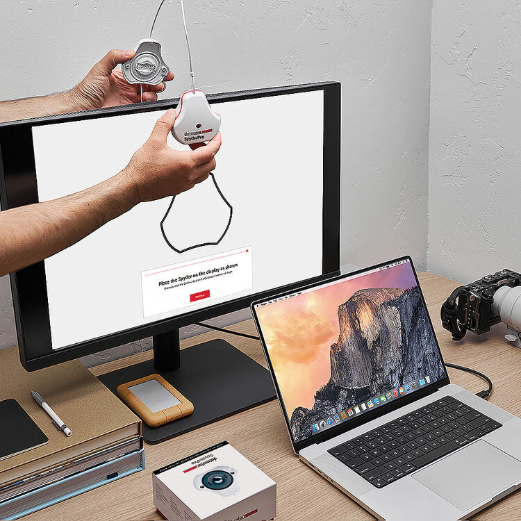
Calibration: The Difference Between Spec Sheet and Reality
Calibration creates a profile correcting for your specific panel's deviations. Software calibration adjusts GPU output via the video card's lookup tables and can be effective for many photographers, though it cannot address monitor-specific behaviors like uniformity or internal processing as cleanly as hardware calibration. Hardware calibration writes corrections directly to the monitor's internal LUTs, preserving more tonal precision in the signal path, but requires a monitor with LUT support and compatible software.
 Marketing claims about internal LUT precision (14-bit, 16-bit) can be confusing. These numbers sometimes refer to internal processing precision, sometimes to 1D LUT depth, and sometimes to actual 3D LUT capability. What matters practically is whether the monitor supports user-addressable 3D LUTs that can store complex color corrections, and whether those corrections survive power cycles and input switching. Review specifications carefully rather than assuming larger numbers always mean better calibration capability.
For measurement devices, colorimeters from Calibrite or Datacolor handle the job capably for most photographers. For general editing, target D65 white point, 100 to 160 cd/m² luminance (depending on your ambient conditions and print-matching needs), and gamma 2.2. Print-matching workflows might prefer D50 and lower luminance. Recalibrate monthly for critical work, quarterly otherwise. If you are working primarily in Lightroom, Mastering Adobe Lightroom: How to Use Lightroom covers color management settings that interact directly with your calibration choices.
Here is the uncomfortable truth: a $200 colorimeter paired with a $400 well-behaved monitor often beats an uncalibrated $1,200 display. Calibration matters more than almost any specification on the box.
Practical Buying Guidance by Workflow
For web and client gallery delivery in sRGB, prioritize accurate sRGB emulation, stable factory calibration, and good calibration support. Wide gamut is nice but not essential.
For print-focused photographers who soft-proof, prioritize high Adobe RGB coverage, strong uniformity, stable white point, and hardware calibration support. A monitor hood helps control ambient light. If you are building or refining a portrait or beauty workflow, accurate color becomes even more critical for skin tone evaluation; tutorials like Illuminating the Face: Lighting for Headshots and Portraits demonstrate how lighting decisions interact with your display's accuracy.
For heavy gradient work (skies, studio backdrops, product photography), prioritize 10-bit pipeline support, reviews showing low banding, and uniformity testing. Product photographers dealing with seamless backdrops will find that uniformity errors create false gradients that waste hours in post.
For variable room lighting, prioritize matte finish or a monitor hood, and set target luminance matching your typical conditions.
Marketing Terms to Ignore
Dynamic Contrast Ratio numbers like "1,000,000:1" are achieved by dimming the backlight completely, telling you nothing about real editing. Response time claims like "1ms" use aggressive overdrive that ruins image quality. "HDR Ready" often means the monitor accepts HDR signals while failing to display them meaningfully. "Professional" without specific gamut coverage, Delta E, and uniformity data is a word, not a specification.
Common Purchasing Mistakes
Buying wide gamut without understanding color management leads to oversaturated exports. Trusting factory calibration indefinitely produces drift you may not notice until prints stop matching. Prioritizing resolution over color accuracy gives you more pixels showing the wrong colors. Ignoring viewing conditions means calibrating a monitor that reflections render useless. Enabling OS HDR mode without understanding its effects on SDR content changes image appearance unpredictably. Assuming expensive means accurate leads to overspending on features that do not improve your work. Buying for video specifications when your workflow is sRGB stills means paying for capabilities you will never use.
The display you edit on shapes every color decision you make. Understanding what these specifications actually measure, rather than what marketing wants you to believe, is the first step toward choosing equipment that genuinely improves your work. Whether you invest in a professional-grade display from Eizo or BenQ or start with a more affordable panel and a quality colorimeter, the key is understanding what you are actually buying and why it matters for your specific workflow.


 English (US) ·