

When we print, we usually want colors and tones to be as accurate as possible. What appears on the paper should match what is on our screens. There are important steps to achieving that.
In my previous two articles about printing, I talked about printers and ink, and then paper. In this one, we are going to look at how colors behave when your computer and printer handle them.
How What is on Your Screen is Different from What Comes Out of Your Printer
RGB
Take a close-up photo of this webpage and zoom in. You will see that the screen consists of tiny red (R), green (G), and blue (B) dots at different brightnesses. Mixing these colors and brightnesses results in a wide range, or gamut, of colors. You may well have seen RGB values that represent different colors.
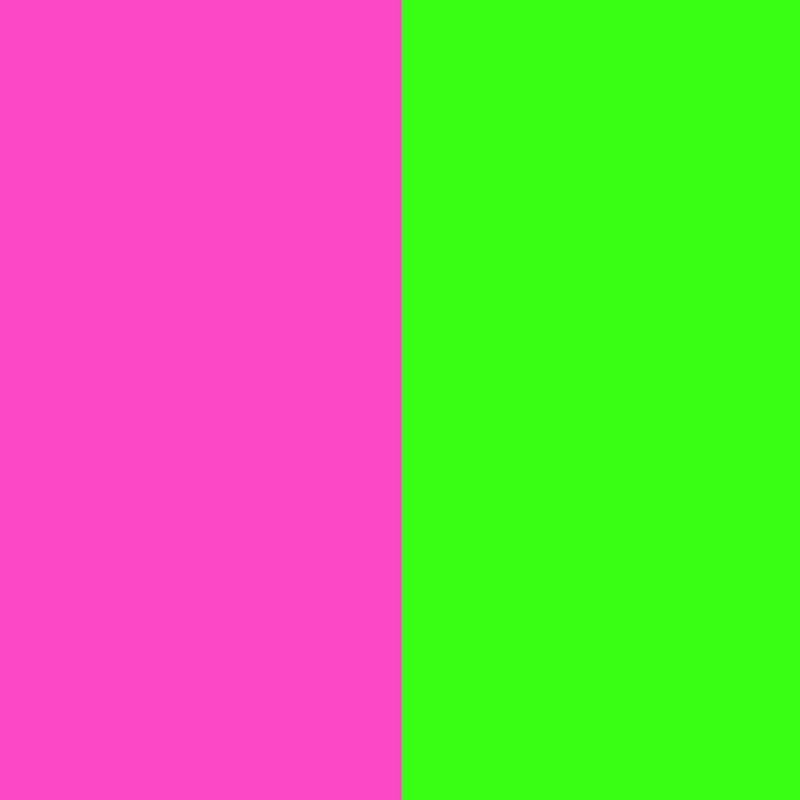
For example, the following swatch is R 255, G 0, B 0

This is R 0, G 255, B0

And this is R 0, G 0, B 255

Meanwhile, we can mix different proportions of those colors. So, the following is R 252, G 197, B 128

You can experiment with color swatches in many editing programs, such as Photoshop, or for free using Gimp or Affinity.
CMYK
Printers don’t use RGB; they use CMYK (Cyan, Magenta, Yellow, Black) inks. Consequently, colors from RGB files must be translated during printing.
Whereas RGB (Red, Green, Blue) is an additive color model used for screens, where colors are created by combining light, CMYK (Cyan, Magenta, Yellow, Black) is a subtractive color model used for printing. In that case, inks absorb some wavelengths of light and reflect others, producing the colors we see.
Neon Colors
It’s worth noting that some colors, such as fluorescent neons, are outside the standard CMYK and pigment-ink gamut. They are achievable only with specialised fluorescent inks, which are not available in most printers.
Calibrate for Color Consistency
One of the most significant problems that you face is that when they share a photo online, most of their audience won’t have their phone or computer screen set to the same brightness as yours. Furthermore, the contrast may be set differently, and even the color may vary. Try comparing the colors above on your computer screen and your phone, and you should see what I mean. Even if you have two screens attached to the same computer, the displays are unlikely to match.
So, it is imperative that you set them up so they match one another; I use two screens, and after calibration, they look the same in color and brightness. This is because I calibrate them.
Calibrating your screen means using a colorimeter such as a Datacolor Spyder. The device sits on your screen, and its software produces a range of colors that the device measures. It can then set your computer to display colors in a particular way. You can then send a photo to someone else, and if their screen is calibrated too, they will view the picture the same way you do.
When we calibrate our screens, we set them to a profile.
 A Datacolor Spyder
When calibrating for printing, I set the brightness target lower than for screen images; usually 100 rather than the software’s recommended 120. This is because screens are backlit and far brighter than paper. The software that comes with the Datacolor Spyder and some other colorimeters shows you the gamut of colors available on a screen compared with selected color spaces, so that you can choose the right space for your system.
Color Space
Most photographers have seen sRGB. This is a color space. A color space defines the range (gamut) of colors a given system can represent. You may also notice others, such as Adobe-RGB (1998) and ProPhoto RGB.
These color spaces differ in their gamut (the range of colors they can represent). sRGB is the smallest and is the web standard. Most consumer screens can display the sRGB color gamut. Meanwhile, Adobe RGB is mid-range. It is excellent for printing, and many professional and high-end monitors are designed to display the Adobe RGB (1998) color space, which offers a broader color gamut than standard sRGB screens. ProPhoto has the most extensive color gamut, including colors beyond the range of human vision. Thus, it has the maximum editing flexibility. It’s great for editing, but requires converting to a smaller space for final output.
The range of colors in a color space is often illustrated by a diagram similar to the one below.
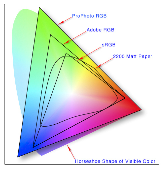 Image created by Jeff Schewe via Wikipedia Creative Commons
Can My Printer Match all the Colors of the Color Space?
The answer to that depends on the printer. The color gamut of CMYK printing with a very basic printer could be smaller than sRGB. However, professional printers might exceed the Adobe RGB (1998) color gamut.
For example, I use a Canon Pro-1100, which has a significantly larger color gamut than s-RGB and Adobe-RGB (1998), and even approaches ProPhoto RGB. That means it can reproduce highly saturated colors and subtle tonal transitions that standard printers cannot. So, I use Adobe RGB. Meanwhile, printers with four cartridges won’t be able to produce as many different colors with their limited ink range.
ICC Profiles
ICC (International Color Consortium) profiles are the backbone of color accuracy. A profile ensures consistency across devices, and it is vital to have the same profile on the screen as you use when printing. It is a set of instructions or data that tells your devices (e.g., your monitor and printer) how to interpret colors within the chosen color space. You can install color profiles on your computer so your photo processing software mimics how a print will look based on the combination of the printer and the chosen paper.
Each printer, paper, and ink combination needs its own profile.
Without ICC profiles, colors can shift between devices, appear inaccurate in hue and contrast compared to what you see on your screen, or be over- or undersaturated. Therefore, it is vital to get those to match, too, using an ICC Profile.
Installing the profiles in your operating system is a simple process. Some may be pre-installed on your computer. Fotospeed, the paper brand I use, provides generic printer/paper combination ICC profiles that you can download from their website. Unzipping and right-clicking the downloaded file installs them on a PC. It’s slightly more complex on a Mac, but a PDF instructions file is included with the download.
Fotospeed also lets you send them a test print, and they will email you back a profile that precisely reflects your printer and paper combination. Some other brands may do the same, and it is worth researching whether this is the case.
Once installed, you can include that profile in your developing and editing programs. You can then preview on your screen to see how the printed image will appear. That process is called soft proofing. I then use that profile when printing.
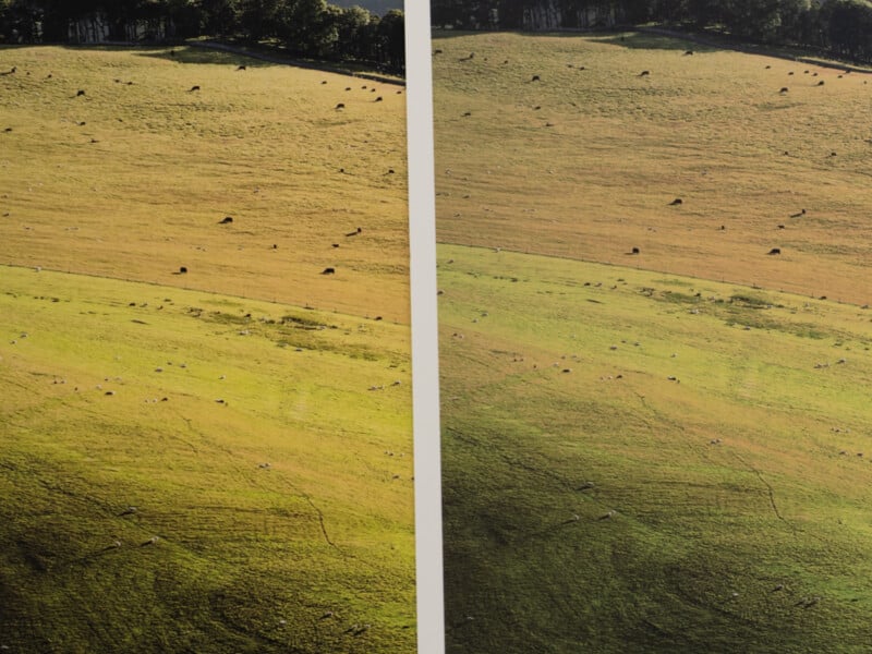 Not applying the correct ICC profile for the paper can result in color shifts between prints.
Embed ICC Profiles in Your Workflow
If your system supports it, edit in a wide-gamut color space (e.g., Adobe RGB). Then export the photo with the correct profile for your printer and paper combination. You should avoid double color management by applying adjustments only once.
It’s always advisable to create test prints before committing to a large batch. Then, evaluate your prints under neutral lighting to avoid color bias. The industry standard is D50 lighting, which has a color temperature of 5000K, a color rendering index (CRI) or color accuracy greater than 90%, and an illumination of around 2000 lux. However, I also check my prints under other light sources. Firstly, this is to check for metamerism. This is where two colors match under one light source but differ under another. Secondly, in real-world settings, lighting does not cohere with the D50 standard.
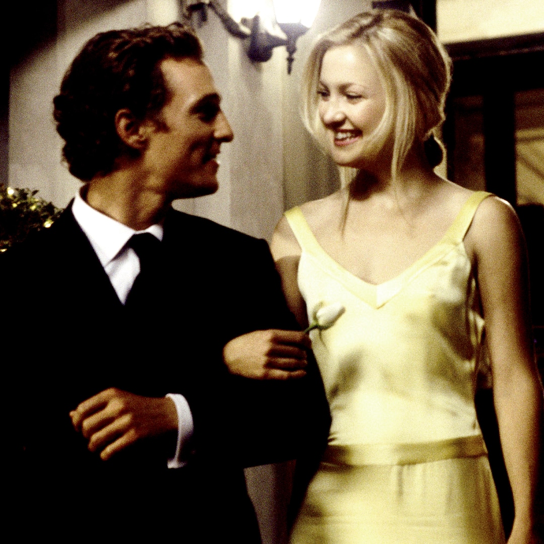
 Using the wrong color space can cause some colors to be out of gamut.
A Couple of Handy Hints
Of course, how colors are interpreted in a photo is a subjective choice. They don’t always have to represent the world as we see it exactly. Nevertheless, I am regularly commissioned to photograph art, and then the colors in my photo must be accurate. I can ensure accuracy by photographing a color-checking chart.
It’s important to remember that the raw files from your camera are not limited to a specific color space. Consequently, they preserve all sensor data for maximum flexibility. The whole gamut of my camera’s raw files is similar to that of ProPhotoRGB and my printer, so your camera should be comparable.
In Conclusion
As you can see from this and previous articles, printing photographs is about precision and control. By selecting the right paper and inks, calibrating your devices, and then using ICC profiles effectively, it is possible produce prints that look the way you want. Mastering color management is the key to that.
Of course, it doesn’t stop there. Once you have printed a photo, you need to decide how and where to display it.
There is a lot to learn, and these three articles have only briefly touched on printing to point you in the right direction. Nevertheless, I will encourage you to get into printing and to research how to pursue it. There are some fabulous books on the topic and untold numbers of videos.


 English (US) ·