
 2 weeks ago
117
2 weeks ago
117
Most photographers hit a wall where their shots feel technically fine but visually flat. Knowing why that happens is the first step to fixing it, and a handful of specific, repeatable mistakes are almost always responsible.
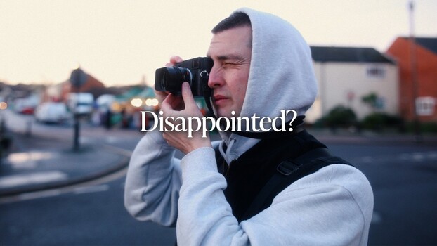
Coming to you from Sean Dalton, this practical video breaks down the most common reasons photos end up looking mediocre, starting with subject selection. Dalton makes a point worth sitting with: a beautiful location does not automatically make an interesting subject, and an ordinary object absolutely can. A chair, shot with the right attention to texture and positioning, can hold more visual weight than a sweeping landscape captured without intention. The ability to recognize which subjects have real photographic potential comes down to taste, and Dalton argues that one of the best ways to sharpen that taste is to study work you admire. Buy a book by a photographer you respect, sit with it, and ask yourself why each subject works. From there, Dalton moves into a related mistake: becoming so fixated on the subject that you ignore everything around it, including light, background, and how the environment either supports or undermines the story you're trying to tell.
The video also addresses lens dependency, which is something a lot of people don't think of as a mistake. Reaching for a shallow depth of field, extreme wide angle distortion, or a compressed telephoto look can feel like a creative choice, but Dalton points out that these effects often function as a crutch. When composition is weak or lighting is poor, lens effects can paper over the problem just enough that you don't fix it. A Black Pro-Mist filter, a telephoto lens, a wide angle lens, any of these are tools, and tools used without intention tend to distract rather than enhance. The stronger move is to get the fundamentals right first, then decide whether a lens effect actually adds something.
Composition gets substantial attention in the video, and Dalton introduces two concepts worth understanding: flow and energy. Where does the eye go when it enters the frame? If something in the composition pushes the eye out of the frame rather than guiding it inward, you lose the viewer. Horizontal lines leading away from the subject, or a person looking into the short side of the frame, are common culprits. Dalton also covers visual hierarchy, specifically the problem of compositions that are too busy, where multiple elements compete for attention at equal visual weight. Depth and negative space are two of the tools he recommends for establishing a clear primary subject without stripping the image of interest.
The final mistake covered is editing against the image rather than with it. Forcing a preset or stylized look onto a photo that doesn't suit it tends to make colors unnatural and skin tones unflattering. Dalton's approach is to ask what the scene felt like when you shot it, then make adjustments that bring that feeling out rather than override it.
Check out the video above for the full rundown from Dalton, including his specific techniques for building visual hierarchy and keeping energy inside the frame.




 English (US) ·