

When we decide whether a photo is good or not, we apply subconsciously a set of principles that make the image appealing. Understanding those helps us better grasp why some photos work better than others.
Photography follows the same guidelines as design and art. Those guidelines are fundamental to creating effective, aesthetically pleasing visual compositions.
Although systematically formulated and taught from the late 19th and early 20th centuries. The principles have been understood for more than 2000 years. The ancient Greeks, including Aristotle and Pythagoras, laid their theoretical foundations. They explored the nature of proportion, harmony, and order in art and nature. Later, the Roman architect Vitruvius wrote about proportion, balance, and harmony in his work. In turn, his work was influenced by Leonardo da Vinci, Leon Battista Alberti, and others.
It was in the late 1800s that Western art education began moving away from storytelling and symbolism toward formal qualities, as seen in movements such as Post-Impressionism, Art Nouveau, and Arts and Crafts; when shape, line, balance, rhythm, and proportion became more important.
This is the key moment for these design principles as we understand them now. They emerged with the Bauhaus school, where Johannes Itten, Paul Klee, Wassily Kandinsky, and Josef Albers developed and taught them.
The principles apply to all visual arts, including photography. Getting to grips with them helps us recognize better compositions when we hold our cameras to our eyes. Knowing about them helps us create more appealing photos.

Visual Weight
To understand the principles of design, one must first appreciate the concept of visual weight. Visual weight is not about physical mass. Instead, it’s the perceived heaviness or importance of an element in a composition. In other words, it’s how strongly it attracts the viewer’s eye compared to other elements.
So, although a large subject can carry a lot of visual weight, it can be balanced by a person, as our eyes are drawn to people, especially to eyes. Similarly, the drawing power of that large object could be outweighed by a smaller splash of bright color.
 The bold reds on the beacon have more visual weight than the more muted hues in the rest of the image.
The Principles of Design
The following are the design principles. As you will see, some of them overlap. Furthermore, they are rarely seen alone, although a composition need not use all of them. Moreover, you might even choose to reject a principle altogether. Like all rules in photography, design principles should guide your decisions rather than dictate them.

Emphasis
Using this principle creates a focal point in a design. It helps to highlight the most important elements, guiding the viewer’s attention. Techniques include using contrasting colors, textures, sizes, and placements to make certain elements stand out.
For example, in wildlife photography, we generally try to isolate a subject by separating it from the background. Taking the above photo as an example, the subject is emphasized with a long lens and a wide aperture, both of which produce a shallow depth of field. The low angle of view also makes the background farther away and smoother. Thus, the subject is emphasized because it is separated from its surroundings by the change in texture, contrast, and color.
If you compare that with the following less appealing photo taken moments later, where the emphasis of the subject is lessened by its busier surroundings, emphasized by the higher camera position and the shorter focal length.

Balance
Balance is how visual weight is distributed in an image. Often found using symmetry, it equalizes the weight on both sides of the picture.
However, balance can also be asymmetrical with different visual weights positioned within the frame that still create a sense of harmony. Achieving balance is crucial for creating stability in a design, whereas imbalance can provide tension, which can be important in some photos.
The following image is balanced by its symmetry. But it also has an imbalance because it is top-heavy. Moreover, the flying geese are more to the right of the frame, and the smaller distant island on the left does ot do enough to balance them.

Contrast
Contrast uses opposing elements, such as light and dark colors, smooth and rough surfaces, small and large subjects, or any other pair of visual antonyms you can think of.
Contrast creates visual interest by drawing attention and helping differentiate elements within the frame.

Repetition
Repetition is the appearance of similar elements throughout a photograph. It creates consistency in an image. Repetition can be applied to colors, shapes, or patterns to reinforce a photograph’s overall theme.
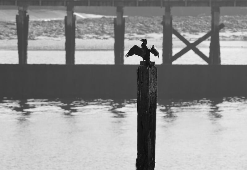
In the photo below, note the repeating patterns of the old, rotten pier and how the shape of the cormorant breaks the pattern.
Proportion
Proportion refers to the relative size of a design’s elements. Helping to create a sense of scale, it influences how the viewer perceives the overall composition of a photograph.
Movement
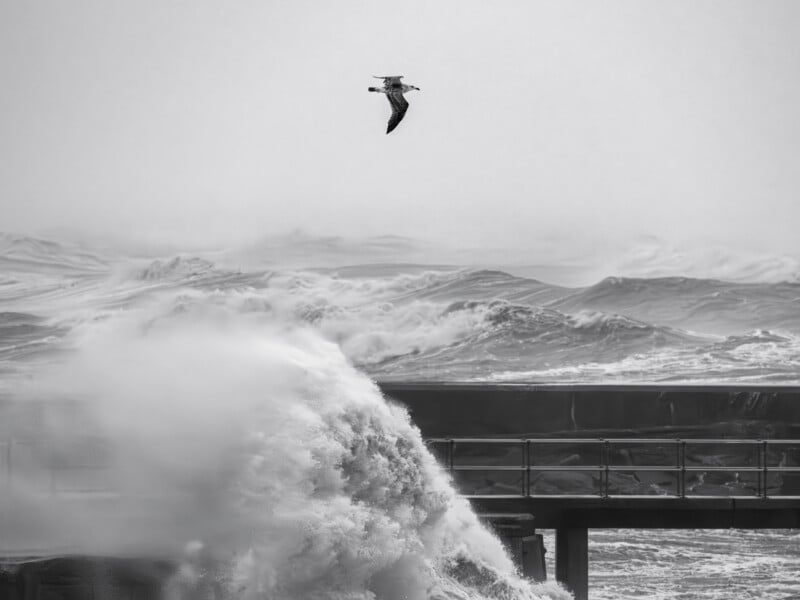
In this context, movement is how the image guides the viewer’s eye through the photo. It can lead the viewer from one element to another through the arrangement of elements, lines, or shapes that create a visual path. Although the following image is ostensibly still, the lines of the pier and, to a lesser extent, the reflections in the water lead the eye to the beacons at the end of the pier.

White Space
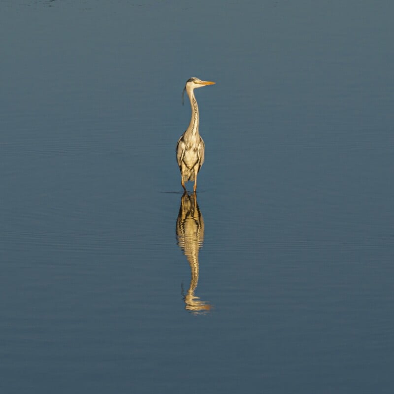
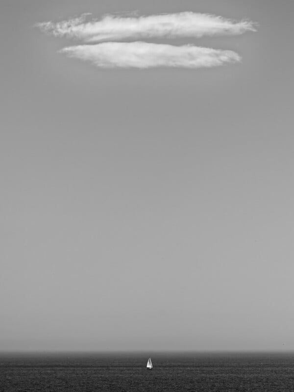
It doesn’t have to be white. Also known as negative space, white space is the area around and between elements in a photo. It also helps to create breathing room and emphasize important components within the image. In the photo below, and a few of the images here, I have used white space to emphasize the subject.

Variety

Variety is the use of differences and contrasts within an image. It creates visual interest. Sometimes, without variety, a picture might feel boring, flat, or repetitive. It is achieved through changes in color, size, shape, texture, tone, and detail.
Compare the image above with the following one. The first depicts patterns in the sand left by the receding tide. Although it was interesting to see, the picture itself was boring. It really needed something to interrupt the pattern.
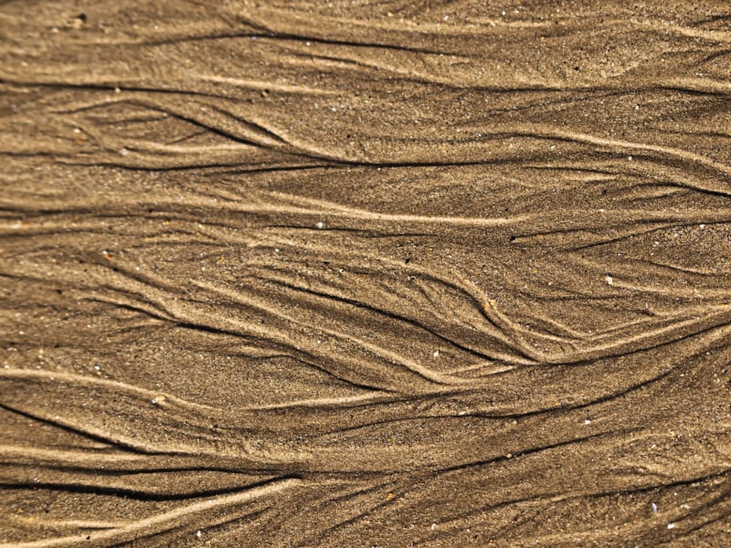
So, this next image is still fairly mundane, but the variety of patterns makes the picture more interesting.

Unity
Unity is the sense that all the parts of your work belong together. When it has unity, it feels whole, organized, and harmonious rather than random or chaotic.
Elements of Design
Often confused with those principles are the elements of design. Where the principles are akin to the grammar of a sentence, the elements are the words. Or, the principles could be the method of making a cake, and the elements the ingredients. In other words, the elements are the basic building blocks of an image.
They consist of lines, shapes, form (three-dimensional shapes), color, value (brightness), texture, and space.
Practical Uses

In reality, when we hold our cameras to our eyes, we are not going to think about these principles and elements. Nevertheless, they are worth studying and considering when we look at our own and others’ photos. In that way, the ideas behind them become ingrained in our minds, and we will subconsciously apply them when we align our lenses with our subjects.
Like always, this article only touches on the surface of these topics, and I’ll be coming back to them in more depth in future articles.


 English (US) ·