
Fear of change is a real thing. There’s even a name for it: metathesiophobia.
Netflix subscribers are apparently a metathesiophobic bunch, because when the streaming service made an overhaul to its app interface with an “upgraded TV experience” back in May 2025, the online forums lit up, with one Reddit user condemning the updated interface as “borderline unusable.”
TechRadar readers, too, joined the chorus of complaints. When my colleague Tom Powers reported on the Netflix UI kerfuffle, his post drew comments such as “the interface is such a disaster it actually makes me feel rage.” Also: “My wife has motion sickness issues and the new UI made her dizzy and nauseous.”
I’m an on-and-off Netflix subscriber, and that’s mainly because there’s a wealth of things to watch on the best streaming services, and I tend to burn through the good stuff on Netflix fairly quickly. But the picture and sound quality of Netflix originals is excellent, with many getting Dolby Vision and Dolby Atmos support, and as someone who regularly tests the best TVs, I tend to let my subscription linger so I can use Netflix shows as a source for my reviews.
It had been a while since I had logged on to Netflix. As you might imagine, when I re-upped my subscription earlier this summer, I was in for a big surprise.
‘Borderline Unusable’
I don’t exactly find the updated Netflix interface to be borderline unusable. It is annoying, however, and reminds me most of the Amazon Prime Video interface, which is equally user-unfriendly, though not as bad as the new Netflix.
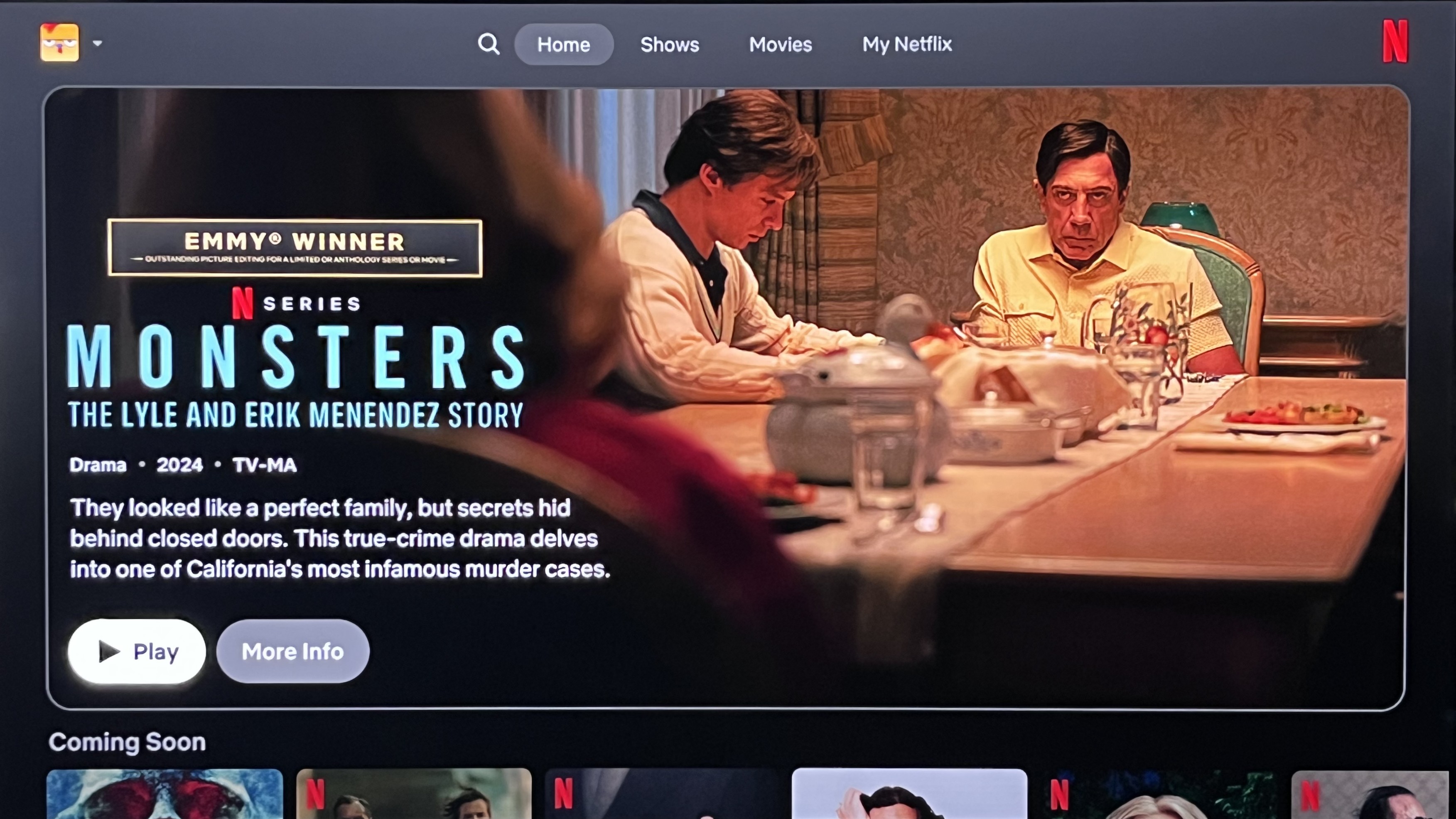
Here are the main things that I dislike about the new interface. When you fire up the Netflix app on your TV, the homescreen is fully dominated by a recommended program based on your recent viewing history (see image at top for an example). You don’t even get a chance to choose anything – a full-motion preview clip automatically starts playing, with a loud soundtrack in some cases.
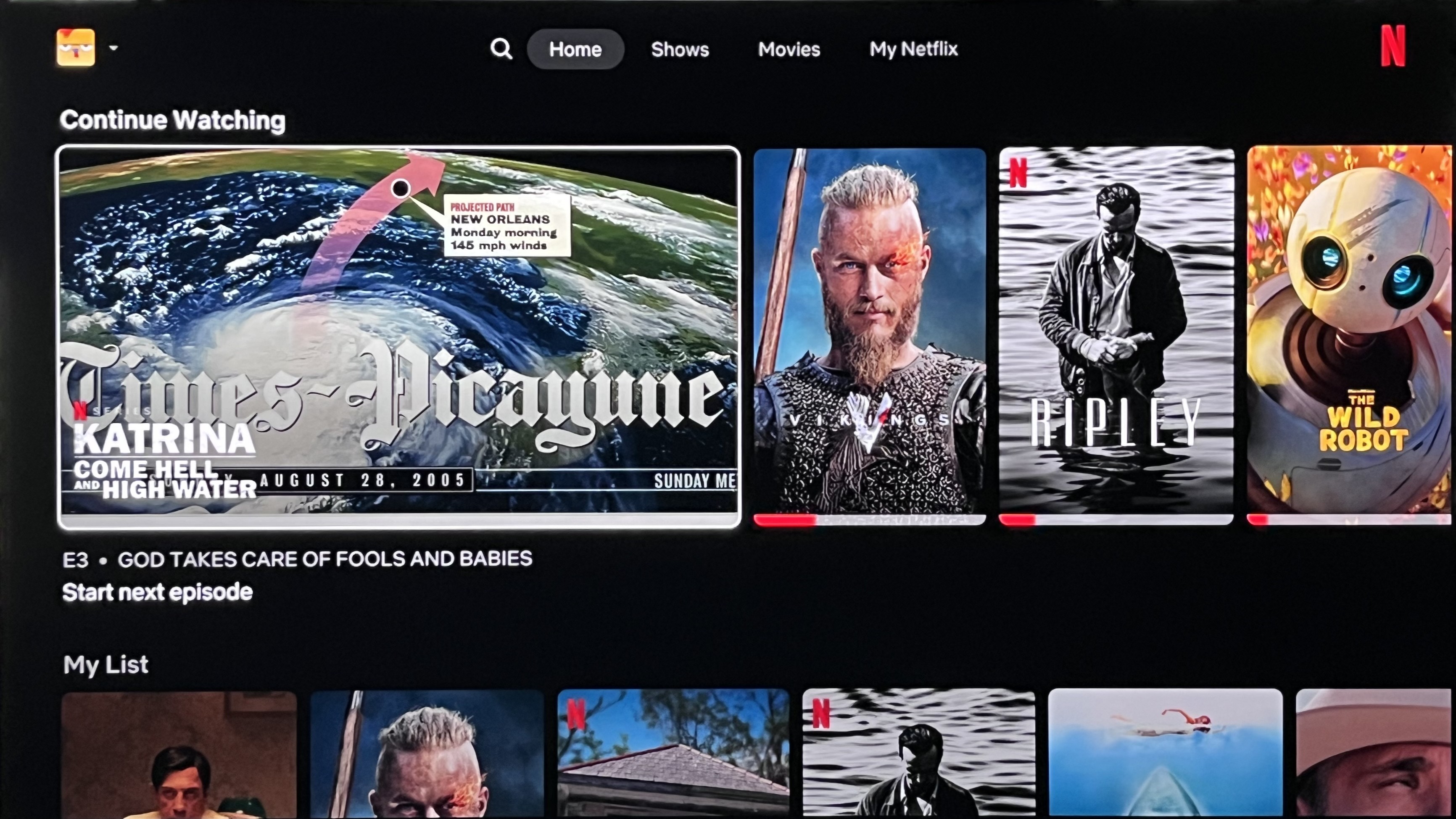
Once you recover from the trauma of that experience (I’m only half-joking), get your bearings, and scroll down the screen to browse the horizontal rows of program categories such as Continue Watching, My List, etc., the first tile in each row blows up to an enlarged size and also automatically plays a preview clip for that program.
Motion sickness? Dizzy and nauseous? I can’t say I’ve felt any of those things when navigating the new Netflix interface, but there is now an awkward and overly kinetic quality to browsing it that I find unappealing. More problematic, the ballooning process cuts down the number of tiles in any row from six to four, effectively reducing the amount of information you can access visually onscreen.
Find a program that looks interesting? Selecting any tile in the Netflix interface quickly fills the screen with a full-motion preview, as if to shove your selection in your face.
Also, the earlier version of Netflix let you easily add a program to your library by clicking a Plus button onscreen. That button is now hidden in the new interface, and you need to scroll down to access it. I’m not sure why, but for some reason, I find this minor change to be the most egregious element of the new Netflix.
‘I will cancel my subscription’
Yes, I will eventually cancel my Netflix subscription, most likely after I finish the new Spike Lee Hurricane Katrina documentary and re-watch 28 Years Later (coming Saturday, September 20), and I won’t miss looking at that updated interface while I’m gone.
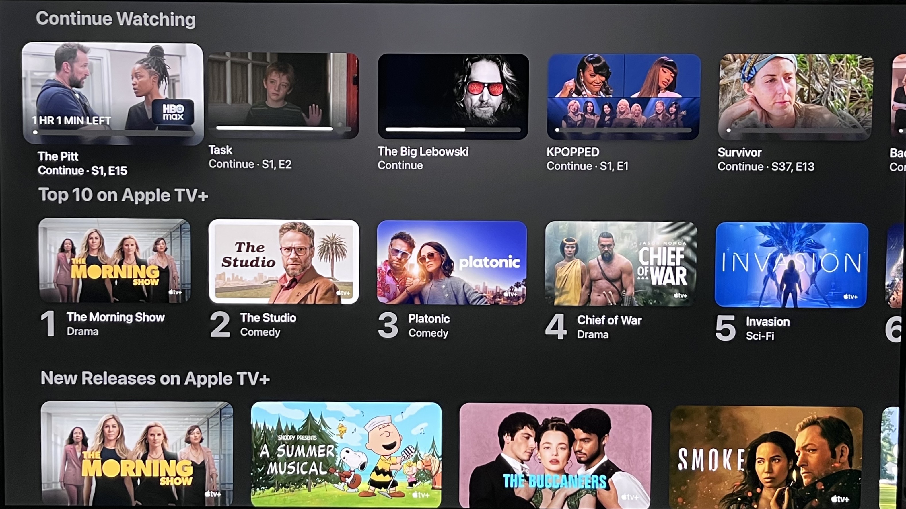
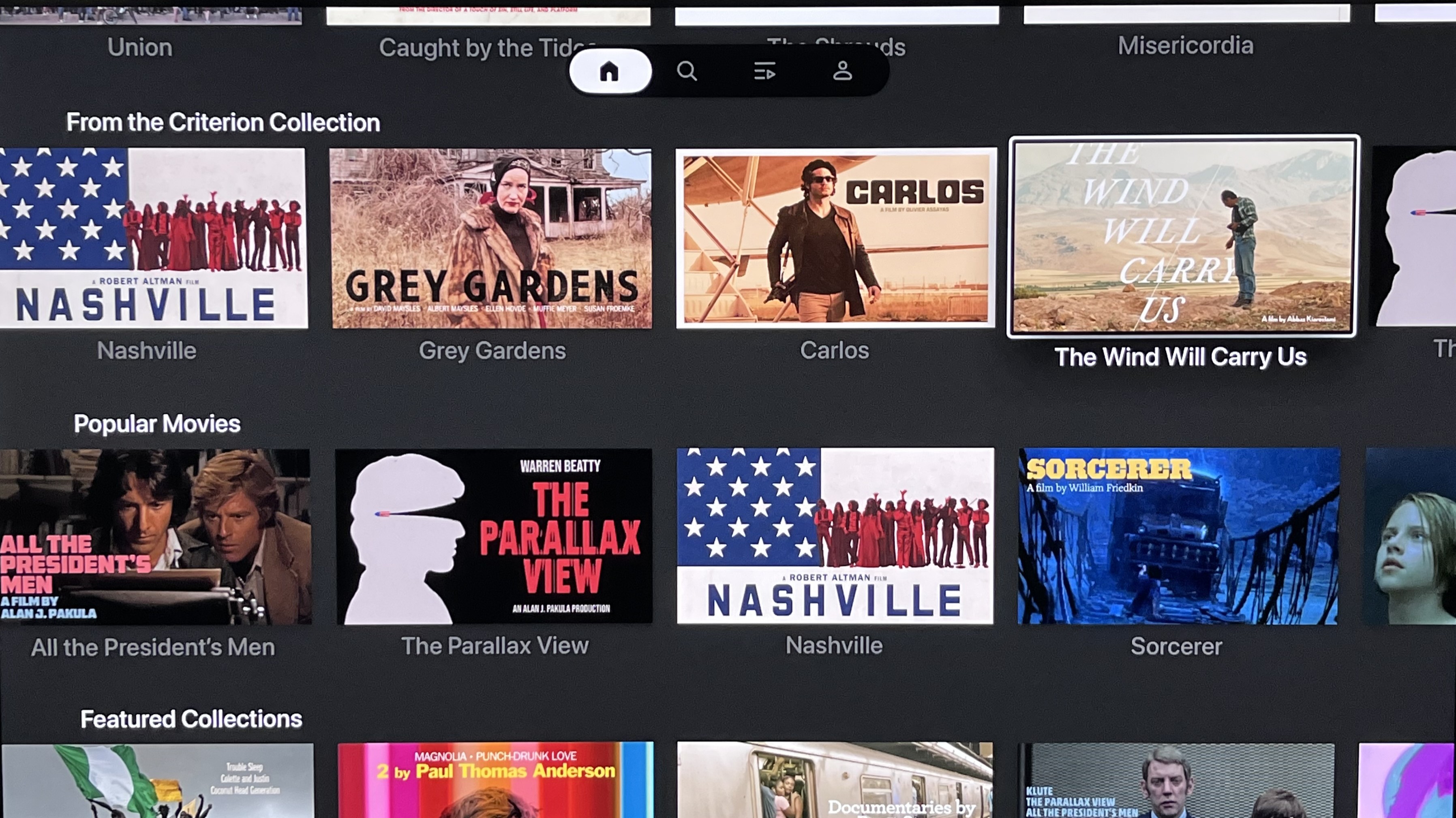
In the meantime, I’d recommend the Netflix UI designers take a look at Apple TV+, HBO Max, and especially The Criterion Channel to get an idea of what a pleasing, informative, and user-friendly app interface looks like.
In the case of Apple TV+ and The Criterion Channel (see examples above), maximum screen space is devoted to program tiles when browsing, and those tiles are fully readable. More importantly, they don’t aggressively kick into autoplay of a preview when you hover over them.
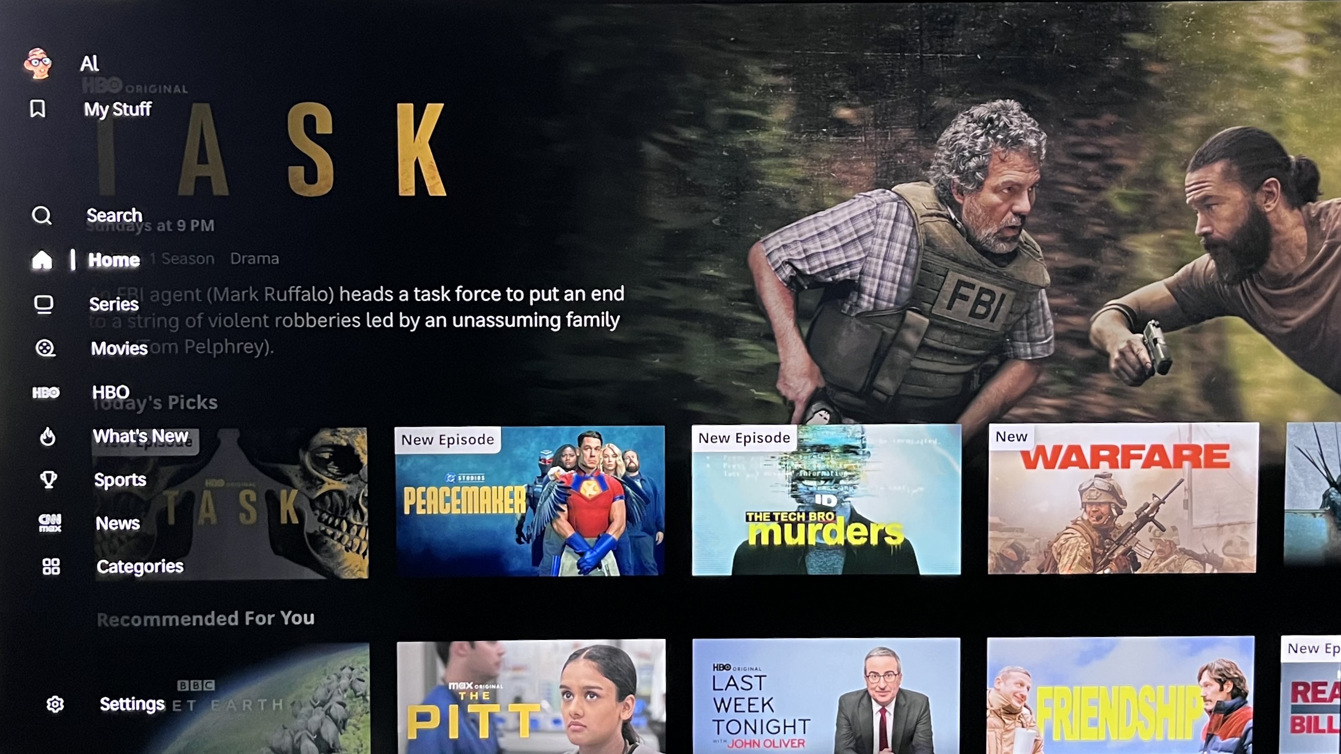
The main HBO Max homescreen does lean into previews, but there is more information to take in when browsing, and there’s none of that ballooning, jump-scare auto-play when hovering over a tile. There is also a vertical menu bar on the left side of the screen that gives you more browsing options – a useful feature HBO Max shares with Apple TV+.
Netflix has apparently pushed back at subscribers complaining about its updated interface, characterizing them as a vocal minority. For Netflix, this is “an improved interface that highlights what matters most to you.”
I’ll grant that there are some updates I like, such as the expanded program information for each title, and the improved My Netflix hub. But for the most part, I miss the old Netflix, and I am clearly not alone.


 English (US) ·