
If extraction shooters are games in which you duck out of the fray between matches to look at what you just collected, I guess I'm almost playing Marathon the right way. I struggle to keep up with a team, let alone support other players in any meaningful manner, and I'm truly useless in most gunfights. But when the game is over I'm still eagerly checking through my winnings.
The difference for me is that my winnings aren't the little bits and pieces I scavenge as I rush around the maps. They're screenshots that I've taken while I'm meant to be scavenging. I am currently intoxicated not by Marathon, then, so much as I'm intoxicated with its world, its art style. I don't think I'm trying to make progress in the campaign or come away with the biggest, newest weapon. Instead, I'm steadily trying to reverse-engineer the game's mood board. So far? I have a few probably wonky ideas.
A caveat up front. Part of Marathon's mood board has involved other people's work, taken without them knowing about it. During Marathon's development, the artist Fern Hook, or Antireal, spotted that their art had been used in the game without permission. Bungie investigated and admitted fault, and Antireal posted online that the matter had been resolved.
This is not a particularly nice story, despite the uptick at the end. Regardless, Antireal is now credited in the game as a "visual design consultant", and this makes sense, as well as giving Antireal some kind of approximation of justice. It makes sense because Marathon may have removed Hook's individual artworks, but Hook's aesthetic and artistry is all over the game, making itself known in multiple places. The two things cannot be stirred apart. (Ditto the work of The Designers Republic, whose "Maximum minimalist" approach - just heard this phrase and I am firmly on board - used by musicians like Aphex Twin and games like Wipeout, feels like another obvious source of inspiration.)
What's surprised me, though, is how many things Marathon invokes. It brings in all kinds of wild elements, while retaining something that feels very much like coherence. This is a neat trick, I think. Marathon is eclectic but harmonious.
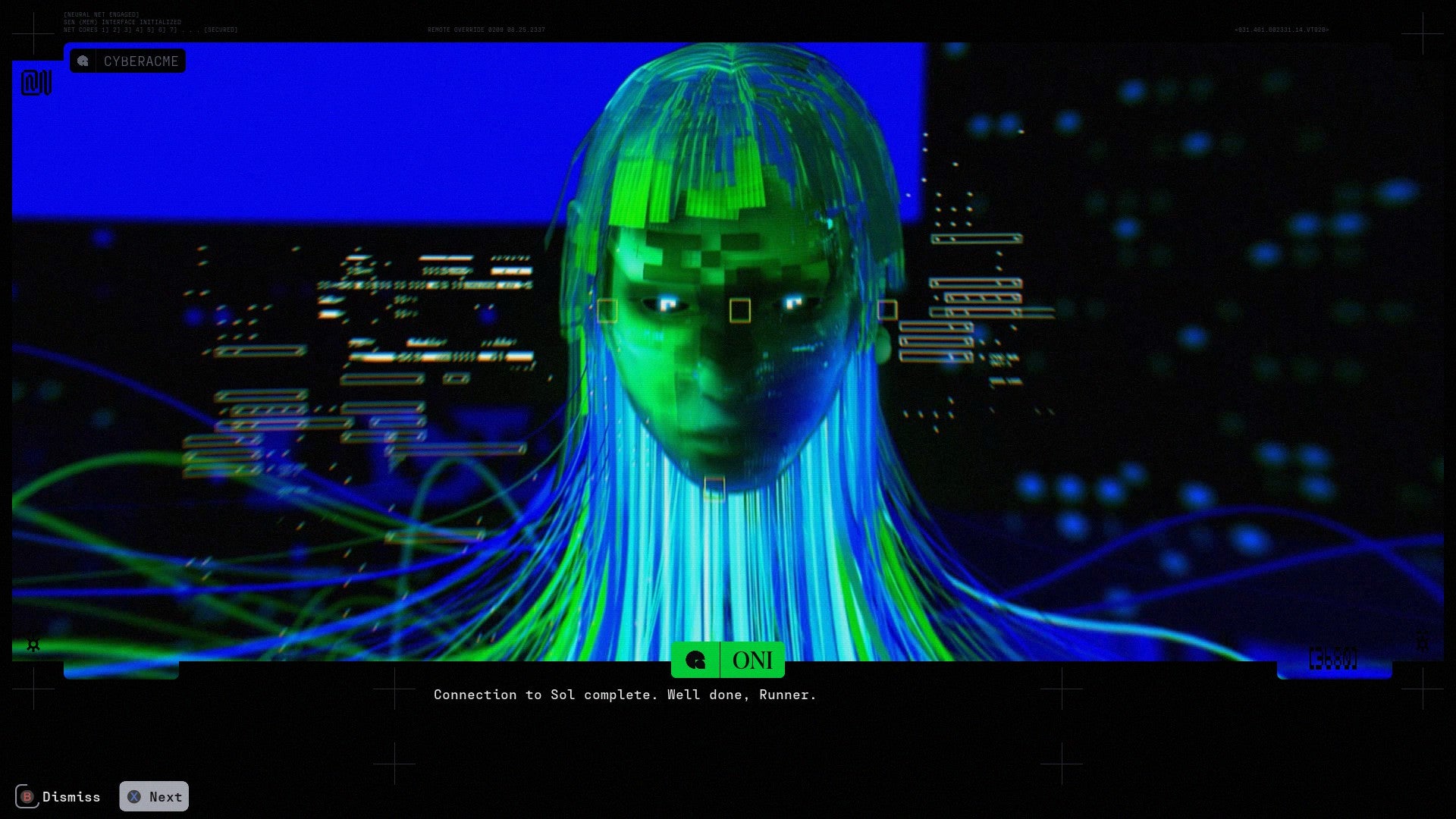
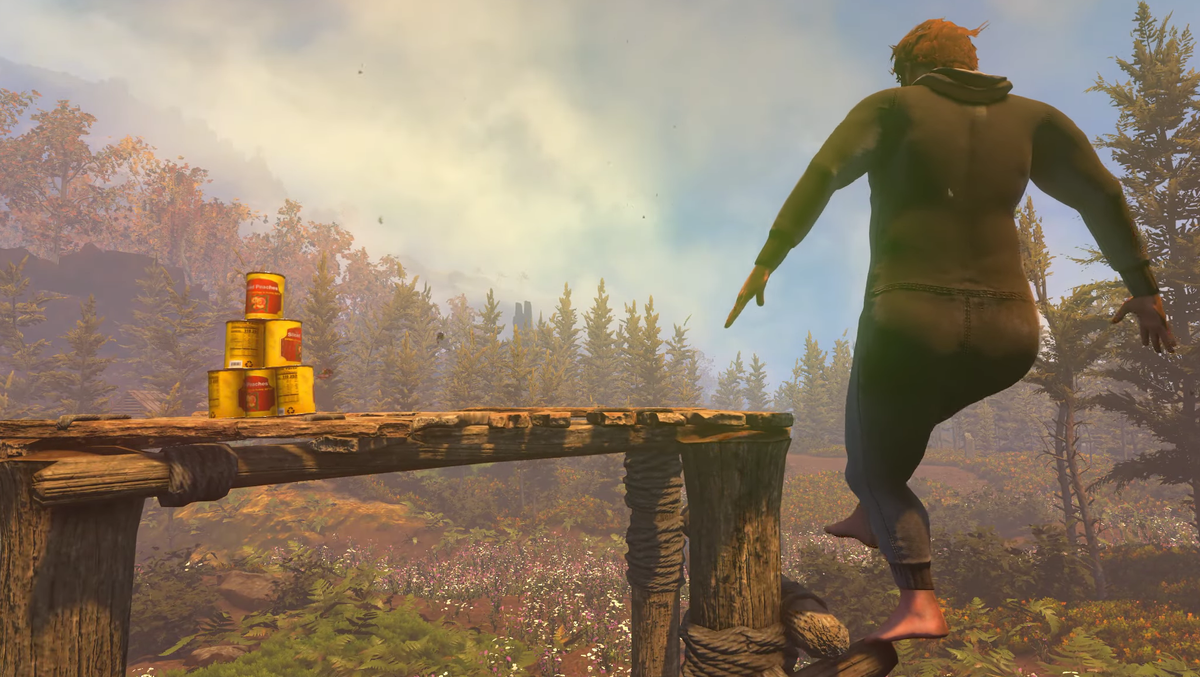
My theory on this so far - although "theory" is pushing it - is that a lot of this feels so good when put together because Marathon dresses in layers. Marathon is set in a surreal sci-fi landscape, so the first layer, at least in the maps I've seen, are shiny black rocks and blasted plains, all of which bring to mind that period where Hollywood space movies looked to Iceland for their distant worlds.
On top of this is another layer, made up of the stuff that humans have dropped into this place. Vehicles, flat-pack buildings, gantries and massive spaceships: this kind of stuff pops up in a bunch of video games. But it tends not to look like this.
Shapes-wise, it feels like Marathon is inspired by the very large pieces of the global supply chain. There are a lot of ersatz warehouses and loading docks, and in a recent match I walked through a canyon that was strewn with what looked like the bizarre strains of specialised vehicles you see tending to planes at airports. The game's really big spaceship is a part of this, too. I was looking at it the other day through my uncorrected long-vision eyes while cleaning my glasses, and the modules and arrangements looked kind of like a container ship and kind of like what I imagine an online shopping fulfilment centre looks like.
But there's another layer right here. Because while this stuff is all ladders and sliding doors and power supplies, it's delivered in strikingly unusual ways. Pinks and yellows and cyans make the buildings look like children's blocks scattered over the ground. Yesterday in the game I saw a row of orange lozenge things, two storeys tall and some of them tipped over, which really look like the cheery packaging from skincare brands like Byoma and Drunk Elephant: curves everywhere and any straight edges rounded down; the feel of thick plastic and injection moulding.
Next there's the layer of human-sized stuff, which plays off the big pieces in interesting ways. People still use laptops in this future, but they also have various mutli-screen gadgets for hacking and healing. Terminals look like the 1970s' idea of the future, while burgers come in what appear to be padded envelopes and other bits of kit come in what appear to be burger boxes.
But it's the next layer that's my favourite. Slapped all over every surface is text-babble and serial numbers and barcodes and all the fabulous Designers Republic font-work. But there's also a lot of things that look like parts of QR codes and other brilliant visual detritus: print registration marks, of the kinds you get in the corners of mags or on the folds of cereal boxes, things that invoke, to my uneducated eye, at least, ordnance survey map markings or perhaps the little tabs attached to people and things in motion-tracking suites. Oh, and because it's space, there are those cross-shaped fiducial markers of the kind that came on all the Apollo Mission images. Nothing says the bureaucracy of the cosmos quite like this.
I didn't realise how well all of this was working until I got a parcel in the post yesterday and the strange, unimaginable process of getting it to me had left it covered with stickers and smudged computer glyphs and all that visual fluff that I normally only half see. It looked like it had come straight from Marathon. Or rather, Marathon uses all these semi-recognisable motifs to conjure a world of fathomless logistics and manufacturing complexity.
And crucially, in amongst the big flat-pack buildings and the Iceland rock and these smaller stickers, along with the coffee cups and the loot you collect and the safety posters scattered around, Marathon adds something else. It adds these micro-layers of weirdness. Buildings will be connected by what looks very much like the inside of Centre Parcs waterslide: there’s one of these in the tutorial, for example. The game's UI has glitches and artefacts and some parts look like old Geocities pages and others look like printed instructions for opening a Tetra-pak, or like the virtual-reality villain of a late 1990s immersive sim.
Combining elements from the Backrooms and also Demoscene traditions, say, explains to me why Marathon feels rich and visually exciting and unknowable, but not quite overwhelming, and why it feels both current yet nostalgic.
So Marathon's an extraction shooter in which the art style feels like it's made of things its designers have grabbed onto while moving at speed. (All too much in the case of Antireal, obviously.) I load the game up not just because the guns are fun - and I love the Edge Mag pink slathered around the place - but because there's always something new to look at and ponder.


 English (US) ·