
- Reddit users are reporting dizziness, vertigo, and eye strain with iOS 26
- This seems to stem from visual effects making icons appear tilted
- There are steps you can take to reduce the issue
It’s safe to say that iOS 26 hasn’t had the smoothest launch – following reports that users regretting the update due to battery life and text legibility issues, we’re now hearing reports of some even more serious issues.
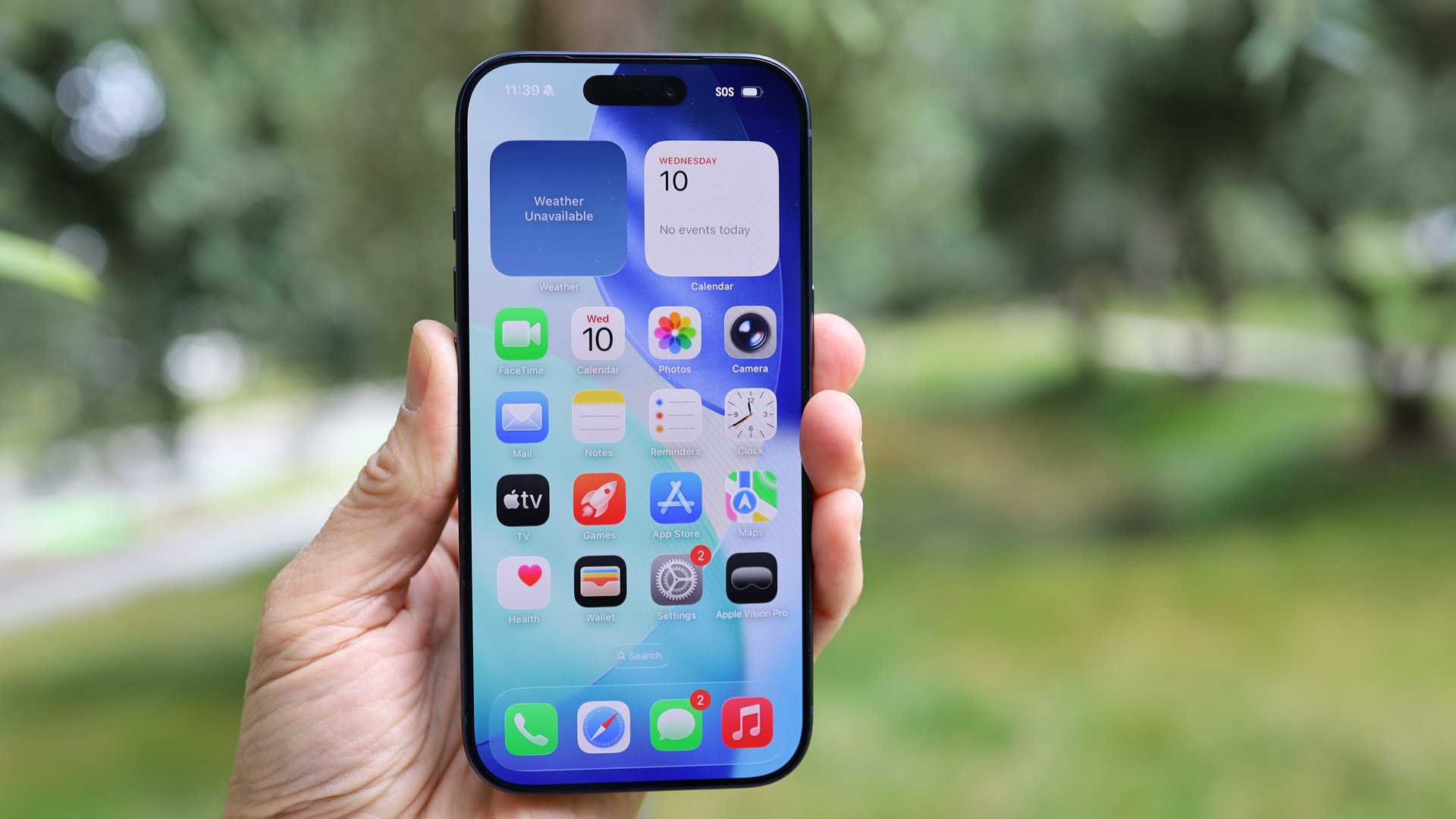
Numerous Reddit users (via Phandroid) have reported that the new Liquid Glass design can make icons appear tilted – particularly when there’s a dark wallpaper or when using the ‘Dark’, ‘Clear’, or ‘Tinted’ icon themes, rather than sticking with the default icons.
The effect is leading some users to feel dizzy, develop eye strain, or even report feelings of vertigo. One poster described it as "an optical nightmare", another claimed "this update is making me feel drunk", and there are many other similar posts.
Escape the effect
Fortunately there are possible fixes to try out. For one thing, you could stick to the default icon style and use a bright wallpaper. That should make the effect less visible, but may not fully solve the problem for everyone.
Another step you can take – as detailed in our guide to making iOS 26 easier on your eyes – is to go to Settings > Accessibility > Display & Text Size and toggle on ‘Reduce Transparency’.
You might also want to increase the contrast, the toggle for which can be found on the same screen.
Of course, having to jump through these hoops just to make your phone usable isn’t ideal. Perhaps Apple could make some tweaks to the Liquid Glass interface design in a future update, to help with visibility.
We’ve reached out to Apple for comment and will update this article if we hear back. Until then, be sure to check out our in-depth iPhone 17 review, iPhone Air review, iPhone 17 Pro review, and iPhone 17 Pro Max review.


 English (US) ·