
Ask any macOS veteran what their favorite part of Apple’s operating system is and I’d bet you a good portion would say Launchpad. This app launcher has been a beloved part of macOS for years, yet Apple unceremoniously did away with it once macOS Tahoe appeared on the scene. And judging by the online reaction, that’s caused a lot of consternation among Mac fans.
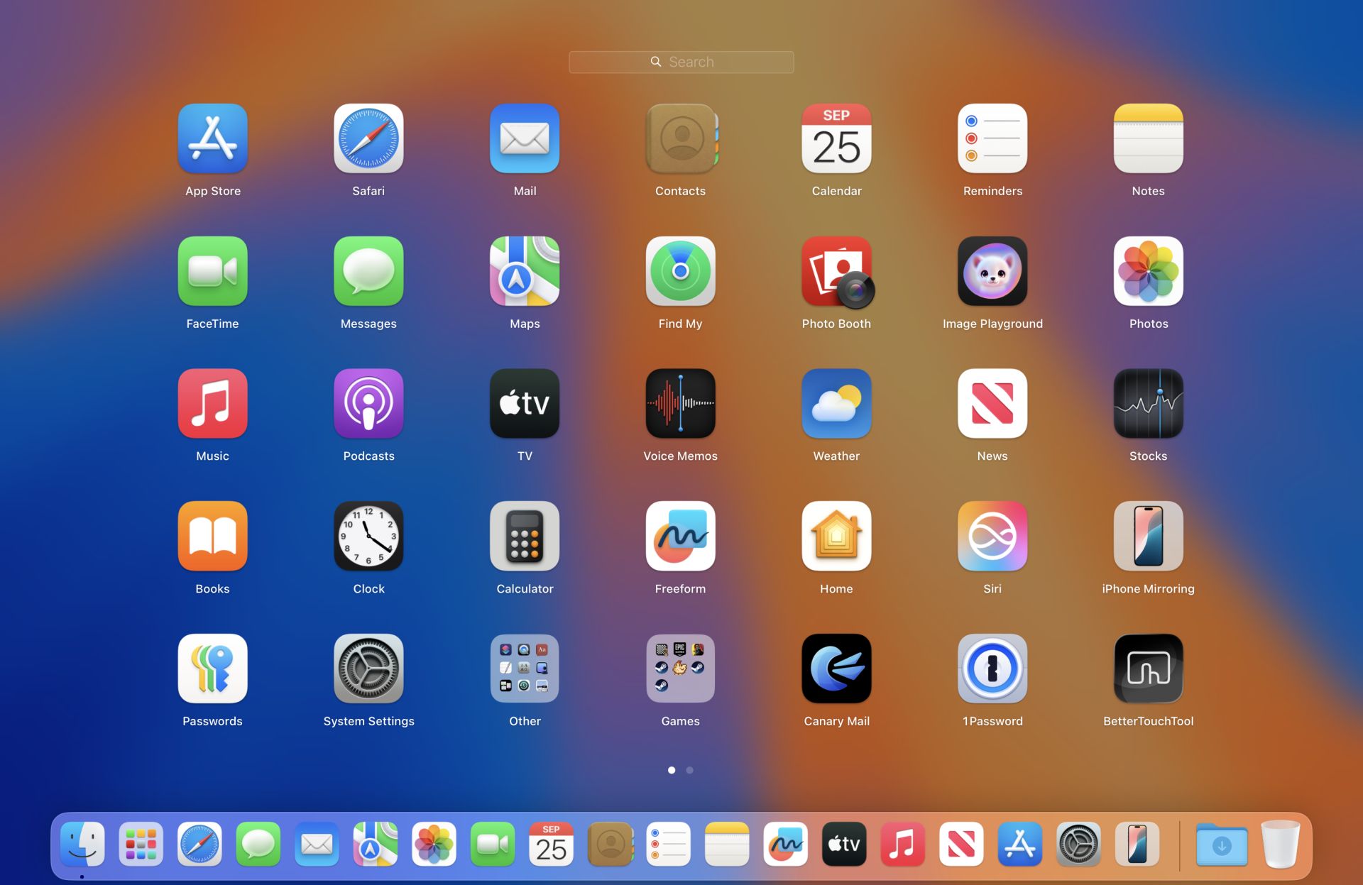
In its place is a new Apps entry in your Dock where Launchpad used to be. Click it and you’ll get a window housing all your installed apps, with a Spotlight search box located at the top. It’s a very different offering to the fullscreen Launchpad, but one that I think is far superior.
In fact, this is one change that I think was actually long overdue. Far from signaling the end of Apple as we know it, I think scrapping Launchpad was actually a good idea – and that the complaints are overblown. I love the new Apps window and think it's a fine addition to macOS Tahoe. Let me explain why.
Ripe for change
I understand that Launchpad was a well-loved element of macOS, and why it has been around for years. That familiarity bred fondness, and it was tough for a lot of people to see it go.
But that shouldn’t mask the issues it had. The main problem with Launchpad was it was disorganized. For one thing, apps would seemingly be arranged in a jumbled, random manner. I’ve lost count of the number of times I swiped back and forth through Launchpad’s screens, desperately search for an app that I just couldn’t seem to locate.
That made apps frustratingly difficult to find. It was just full-screen grid after full-screen grid of haphazardly ordered apps. You couldn’t sort your apps alphabetically to make them easier to find – or sort them in any way at all beyond manually dragging and dropping them one by one, in fact. That got old pretty fast.
As well as that, it was a full-screen app, which meant that apps were spread all across your display. That was fine on a small, 13-inch MacBook Air screen, where you didn’t have to look far to scan from one edge of your device to the other. But if you used an iMac or a large external monitor with your Mac, it meant you had to search over a much wider area, physically turning your head left and right like you were at a tennis game.
Individual apps were also so widely spaced that you often had to swipe through multiple screens to find that app you were after, where a more compact design would have helped fit more into one pane. It just felt annoyingly airy when something more compressed and efficient could have served you better.
Launchpad was well-loved, but it was also clunky and poorly organized. Ultimately, it was ripe for change.
A better way
Now contrast all that with the new Apps window, which I think is a far better solution.
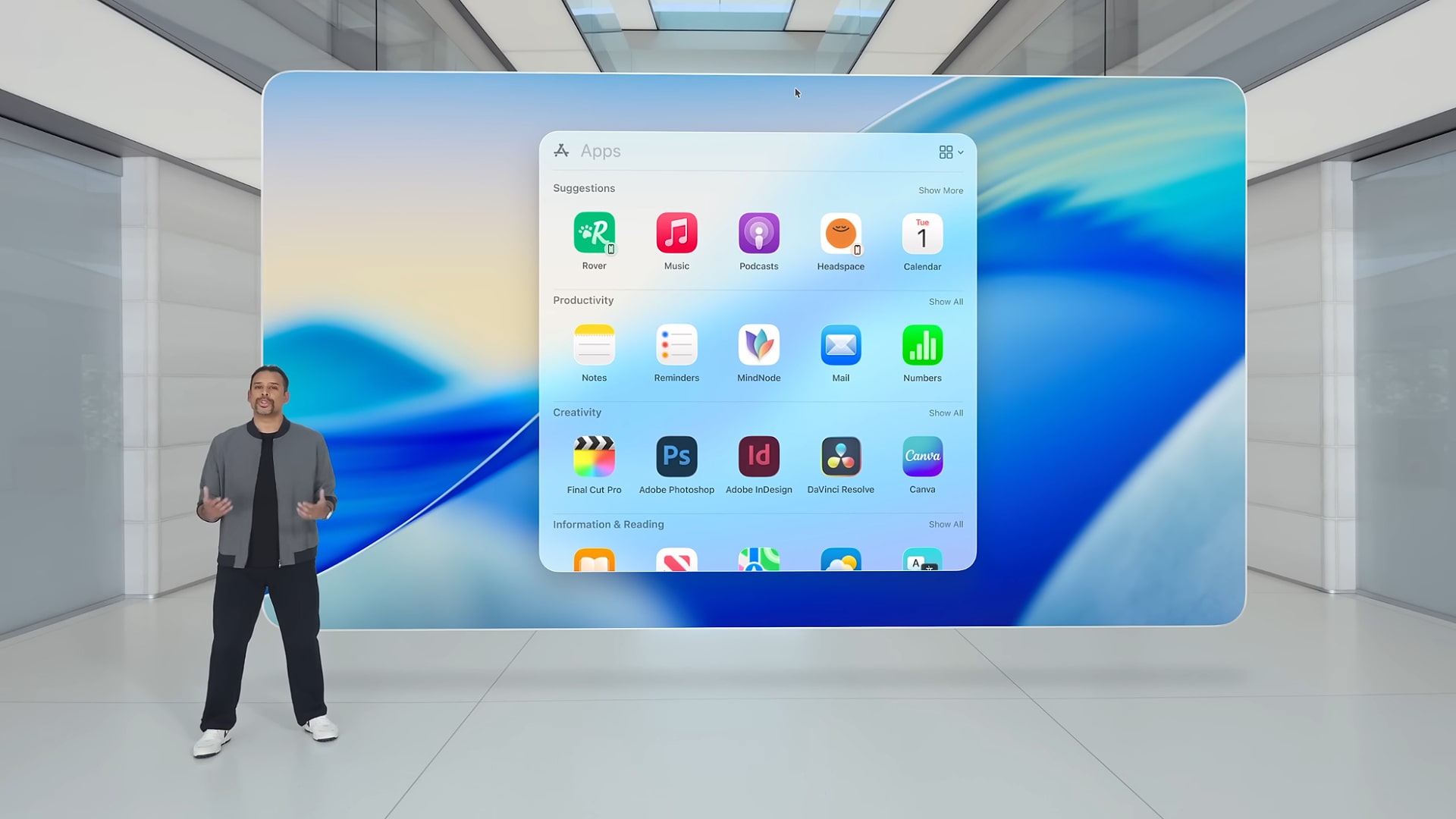
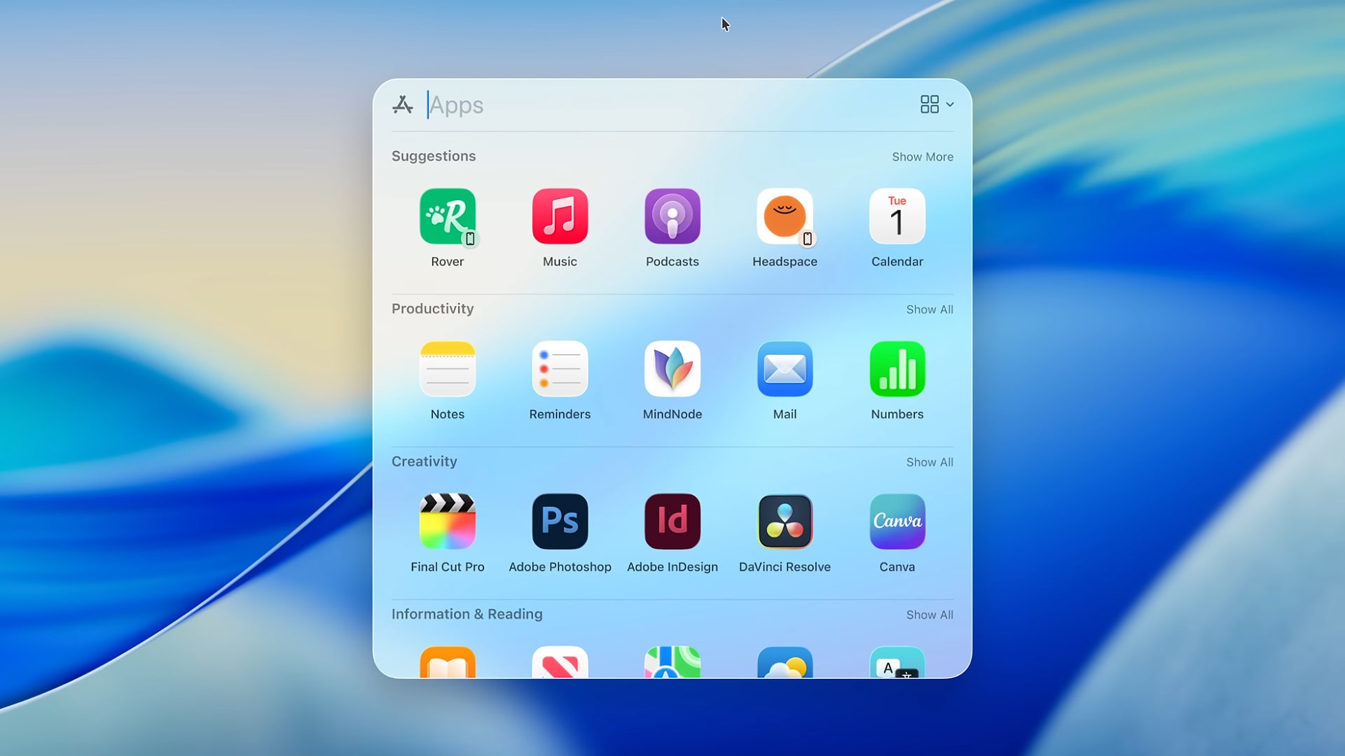
In macOS Tahoe, apps are organized alphabetically by default in the Apps window. That makes it quick and easy to find the apps you’re looking for by name. As well as that, the apps that you use the most are intelligently floated to the top in their own section. It works a little like the Smart Stack in iOS 26 and means there’s no need to scroll at all to find your favorite apps.
You also get many more customization and sorting options with the new app launcher. There are tabs at the top to filter by app type, including Productivity, Utilities, Entertainment, and more. There’s a switch to change the view from a grid to a list, allowing you to view your apps in a way that suits you. And you can show or hide iPhone apps that run on your Mac, if you like. None of these options were available in the old Launchpad.
That’s not forgetting the redesigned interface that puts a large search box at the top of the Apps window in macOS Tahoe. Sure, Launchpad had a search bar, but it was tiny and hidden away at the top of your display. Now, it’s far more prominent and usable.
Click the Apps icon to the left of the search bar and you go straight to Spotlight, giving you a quick way to access all the handy new features that Apple’s search tool has been outfitted with. You can do the reverse, too, accessing the Apps window after activating Spotlight, all without needing to click the Apps icon in your Dock.
Overdue an overhaul
There’s no denying that Launchpad was a popular part of macOS, but we shouldn’t be blind to its faults. It had needed an overhaul for years, and Apple has done a good job reworking it into a more modern launcher that’s fit for the future.
In my opinion, the Apps window is a better replacement in a variety of different ways. I’m sure there are plenty of people who will disagree, but I can’t hide the fact that I find it superior for the way I use my Mac.
As they say, the only constant is change. In this instance, that’s probably a good thing.
You might also like...
- I started using a Mac full time for work – but these are the things I missed from Windows 11 that made me switch back
- I've been using macOS Tahoe 26 for a month – here are the 5 features you should try first
- macOS Tahoe 26 is official: here’s everything we know about the release date, compatibility and all the new features


 English (US) ·