
Serving tech enthusiasts for over 25 years.
TechSpot means tech analysis and advice you can trust.
In a nutshell: Google is rumored to unveil its Material 3 Expressive design language at its I/O developer conference later this month. A recent tipster leak gave us our first glimpse of the redesigned UI, revealing some of its key elements. Then on Monday, Google unexpectedly published – then deleted – an official blog post detailing various aspects of the new design language.
The article, which is still accessible via the Wayback Machine, describes what Google calls its "most-researched" update to a design language. According to the company, Material 3 Expressive (M3E) was the result of a collaborative effort among its research, design, and engineering teams, aimed at creating a user experience that resonates "on an emotional level."
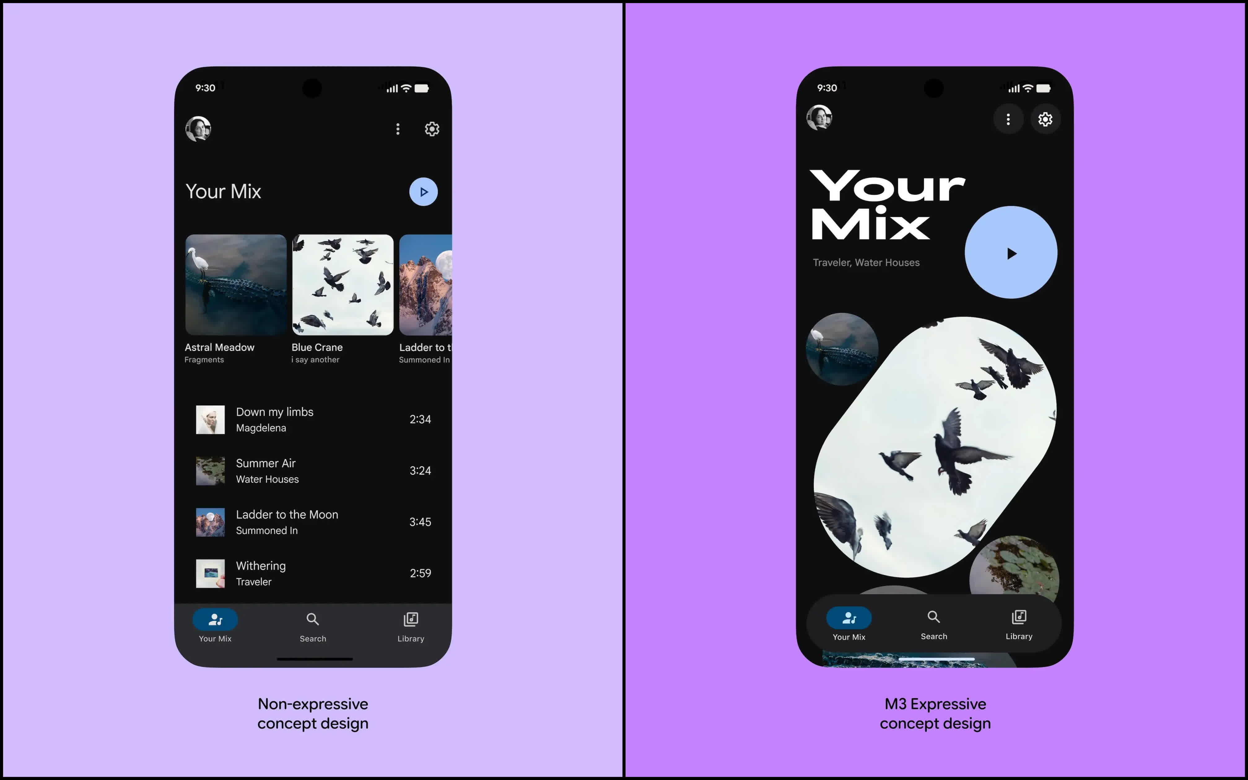
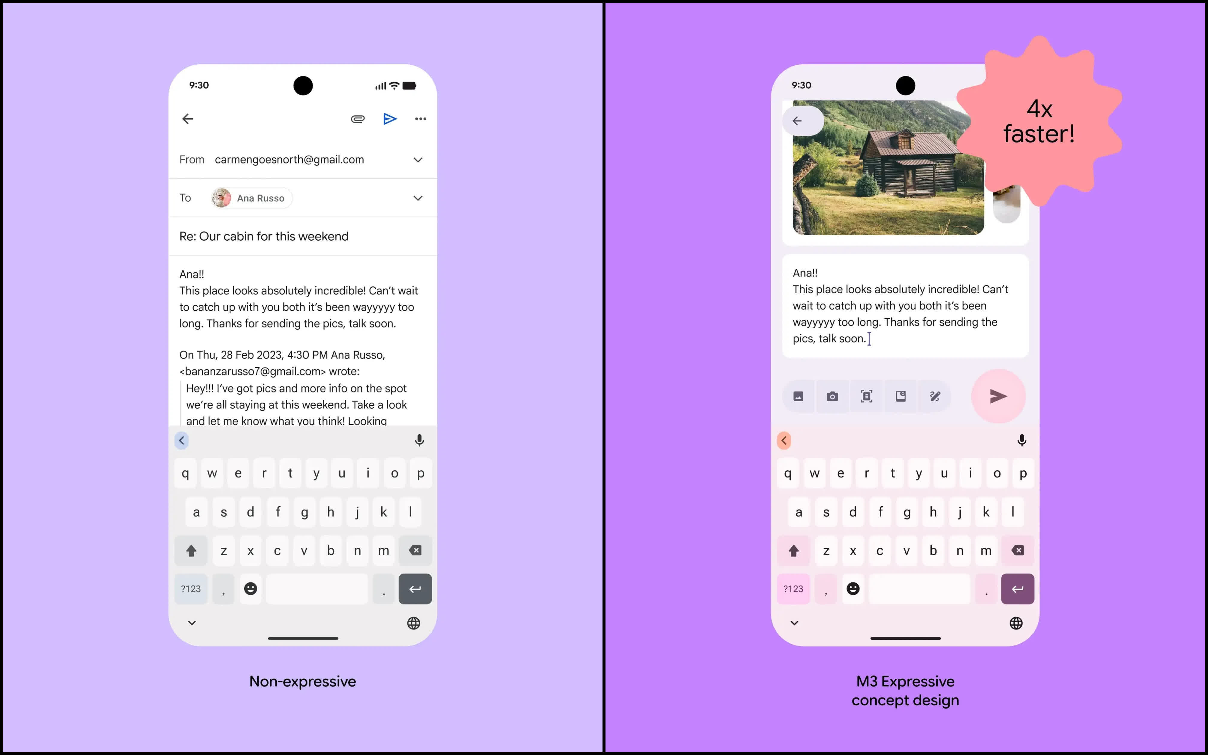
Largely an updated iteration of Material You (also known as Material 3) which debuted in 2021, M3E emphasizes color, shape, size, motion, and containment to make the user interface easier to navigate. To that end, Google introduced larger buttons, high-contrast visual boundaries, and other expressive design elements – changes that reportedly helped focus group participants identify key UI features up to four times faster.
For example, the post highlights the redesigned 'Send' button in the M3E-based Gmail app. It is now larger, positioned just above the keyboard, and styled with a secondary color to draw attention. This marks a significant change from the current app, where the Send button is tucked away in the top toolbar alongside other controls – an arrangement that can make it harder to find, especially for older users.
The post also included several concept images showcasing redesigned versions of various apps and features – such as the Clock app, voice input, photo editor, payments, and Wallet – all following M3E design principles.
The new design language will extend across all Google apps and services, including Android 16. While the post did not officially confirm Wear OS support, it is likely that M3E will be adopted there as well.
A recent leak revealed a redesigned Clock app for Android built with M3E. The mockups show adjustments to the bottom toolbar, including a new 'World Clock' label for the Clock button. The app also features a new font, while the Alarms page has received a significant overhaul with elongated time selectors and an oval-shaped Start button. Additionally, the Stopwatch tab now displays a cubicle-shaped timer instead of the current circular one.


 English (US) ·