Mad Magazine is a cultural institution, but its role in the history of American humor is getting harder and harder for younger generations to fully grasp. That is especially true when it comes to the magazine's cover art. Like album covers, the cover of a magazine issue used to be the start of a dialogue with potential readers.
It had to grab a person's attention, compelling them to grab it off the newsstand and at least flip through the pages, if not outright buy it. Mad magazine mastered the art of delivering covers that screamed "must read" early on. The covers curated below are the most historic in the publication's long history.
10 Mad #30 (December 1956)
Art By Norman Mingo
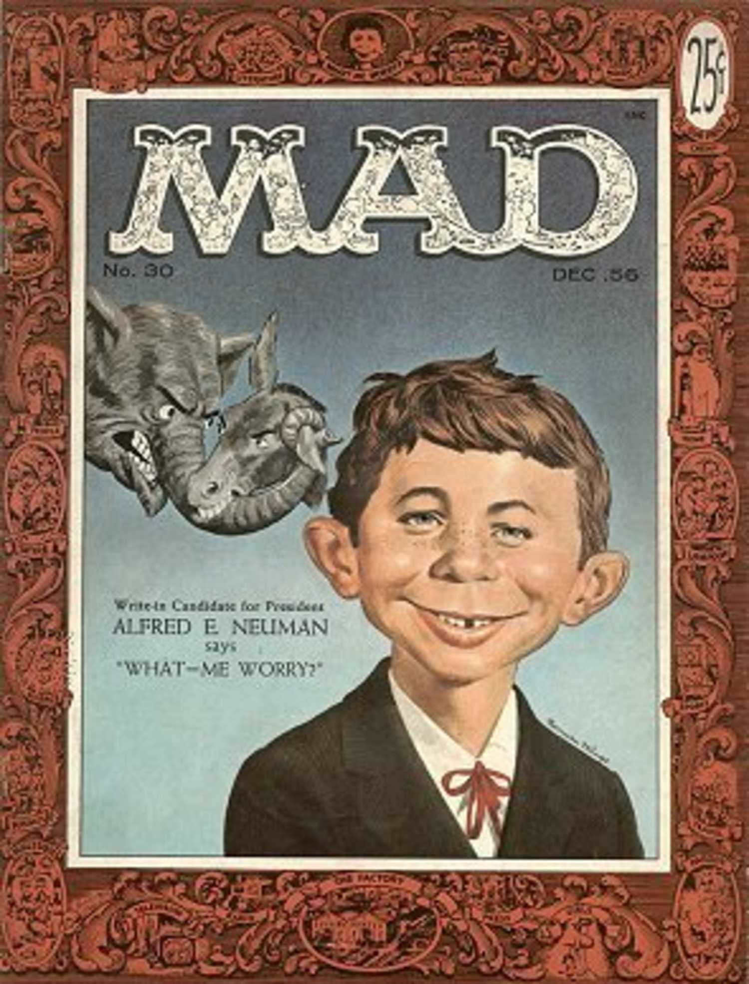
Mad's rascally mascot, red-haired, gap-toothed Alfred E. Neuman, made his full-on cover debut in December 1956. He made his very first cover appearance the previous year, popping up in a "cameo" of sorts on the cover of Mad #21. Neuman then became the unofficial figurehead for Mad starting with issue #24, when it switched from a comic to magazine format, appearing at the top of each cover as a small portrait in its border.
Mad #30 identified him as Alfred E. Neuman, a "Write-in candidate for President." Though the '56 election was already in the books by the time the issue hit stands, it has reportedly inspired generations of actual votes cast for the character in every presidential election since. Since then, Alfie, or Freddy, or whatever his friends call him, if he has any friends, has appeared on nearly every Mad cover since, and remains synonymous with the magazine.
9 Mad #54 (April 1960)
Art By Kelly Freas
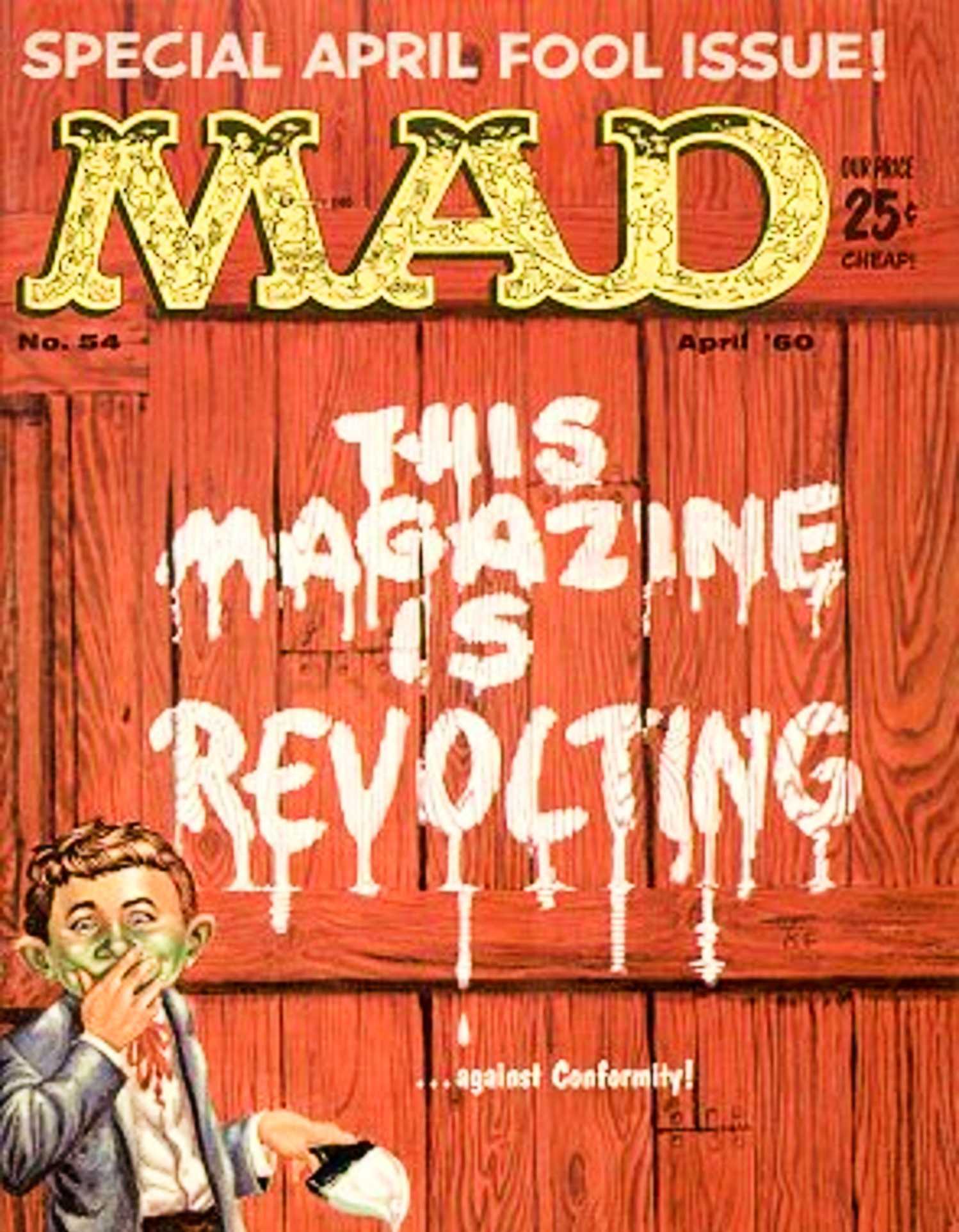
Here, the cover to 1960's "Special April Fools Issue" of Mad finds Alfred E. Neuman engaging in a little playful vandalism. "THIS MAGAZINE IS REVOLTING," reads the broadside that he has painting on the broad side of a barn, the letters in white paint, still dripping, as Neuman stands there, brush in one hand, covering his mouth as he giggles with another.
At first glance, someone who found Mad offensive might see the cover of this issue and think, "Hey, some much-needed self-awareness from these purveyors of filth." That is, until a closer look at the fine print. "...against Conformity!" is written in tiny white letters below "revolting," completely changing the meaning of the graffiti. It is a reminder that Mad, at least early on, wasn't just joking with readers, it was playing jokes on them.
8 Mad Magazine #83, (December 1963)
Layout By Mad Editorial Staff

Yes, Alfred E. Neuman has dominated Mad's covers for 70 years now, but that is why some of the most memorable Mad covers are ones he's absent from. It makes sense; Mad was all about breaking rules, even its own rules. Especially in the early 1960s, the magazine was also all about breaking, or embracing, taboos. Like "SEX," which stands out in bold pink capital letters against a black background on the cover of this issue.
Surrounding the attention-grabbing word, in much smaller font, is a lengthy disclaimer in white:
In order to sell products these days, Madison Avenue, Hollywood, television, other publishers...everybody exploits [SEX]...but we'd never stoop that low!
It is a great bit, given the buttoned-up attitude toward sexuality in media in 1963. Also consider that this issue of Mad was published at a time of national mourning, just a month after the JFK assassination. A normal Mad cover might not have been enough to get readers attention, but this visually evocative change of pace was exactly what the magazine needed to do to stand out.
7 Mad #166 (April 1974)
Art By Norman Mingo

The cover of Mad #166 was a direct response to anyone who had a problem with the magazine. A middle finger right in the face. It was meant to be offensive to critics of Mad. Their response to the criticism was simple, but emphatic: "If you can't take our jokes, here you go."
"The number one ecch magazine," the cover proclaims. As in, if Mad makes readers clear their throats in disgust when they see it on the newsstand, well, it is the very best at eliciting that reaction. The boldness of this covert art choice is somewhat lost in translation 52 years later, but at the time, it was a hilariously defiant move by Mad.
6 Mad #198 (April 1978)
Layout By Mad Editorial Staff

In early 1978, the editors at Mad were mad as hell, and they weren't going to take it anymore. Well, actually, they were going to take it, because they had no choice, but they weren't going to take it lying down. Take what? Being forced to put a 'yechhy UPC symbol" on their covers "from now on."
That's right. UPCs are so ubiquitous now that most people don't even notice it when looking at a magazine cover. 48 years ago, it was a cause for indignance at Mad, leading the magazine to devote a cover to a giant UPC barcode, with a bratty headline proclaiming: "Hope this jams every computer in the country..."
5 Mad #221 (March 1981)
Layout By Mad Editorial Staff

"Shorting Coming!" That's the bold red proclamation on the cover of Mad #221. Under that, in black, the cover exhorts readers to "hoard this issue!" In the bottom right corner, balancing out that pesky UPC in the bottom left, Alfred E. Neuman sticks out his tongue at the reader.
When this issue came out in March 1981, the U.S. economy was bracing for a recession, and dealing with years of inflation. Just look at the cost of Mad itself. Issue #221 was 75 cents, the same it had been since going up from 65 centers in the summer of 1979. But the very next month? In April '81, with Mad #222, the magazine went up to 90 cents, and by July 1982, it would be up to one dollar.
4 Mad #264 (July 1986)
Art By Mort Drucker

Over time, Mad magazine went from counterculture to pop culture. (It happens to the best of them.) A large part of that shift was that its covers became less confrontational. More and more, they focused on parodies. With the cover for issue #264, Mad got in on "Hulkamania," when pro wrestling exploded into the mainstream consciousness (in a way, going from counterculture to pop culture in its own right) courtesy of Hulk Hogan.
Here, the Hulkster has Alfred E. Neuman in a submission hold, twisting the mascot into a pretzel behind his back. In a way, getting parodied by Mad was just one more way in which Hogan took over the world in the mid-1980s, paving the way for the massive success of wrestling as a global phenomenon over the next 40 years.
3 Mad #299 (December 1990)
Art By Mort Drucker

When The Simpsons debuted and quickly became a sensation in the late 1980s, it was, in a sense, the culmination of a decades-long evolution of American humor. Or, more accurately, the long road for a certain warped comedic sensibility to become mainstream. The Simpsons build on a foundation laid by Gary Larson's The Far Side throughout the '80s, and before that, by magazines like National Lampoon and Mad.
And in this issue, Mad turned its parodic gaze on the animated series, stating its intentions to "mow down The Simpsons" (along with th Schwarzenegger movie Total Recall), starting with Alfred E. Neuman literally mowing an annoyed Bart Simpson's spikey hair.
2 Mad #340 (October/November 1995)
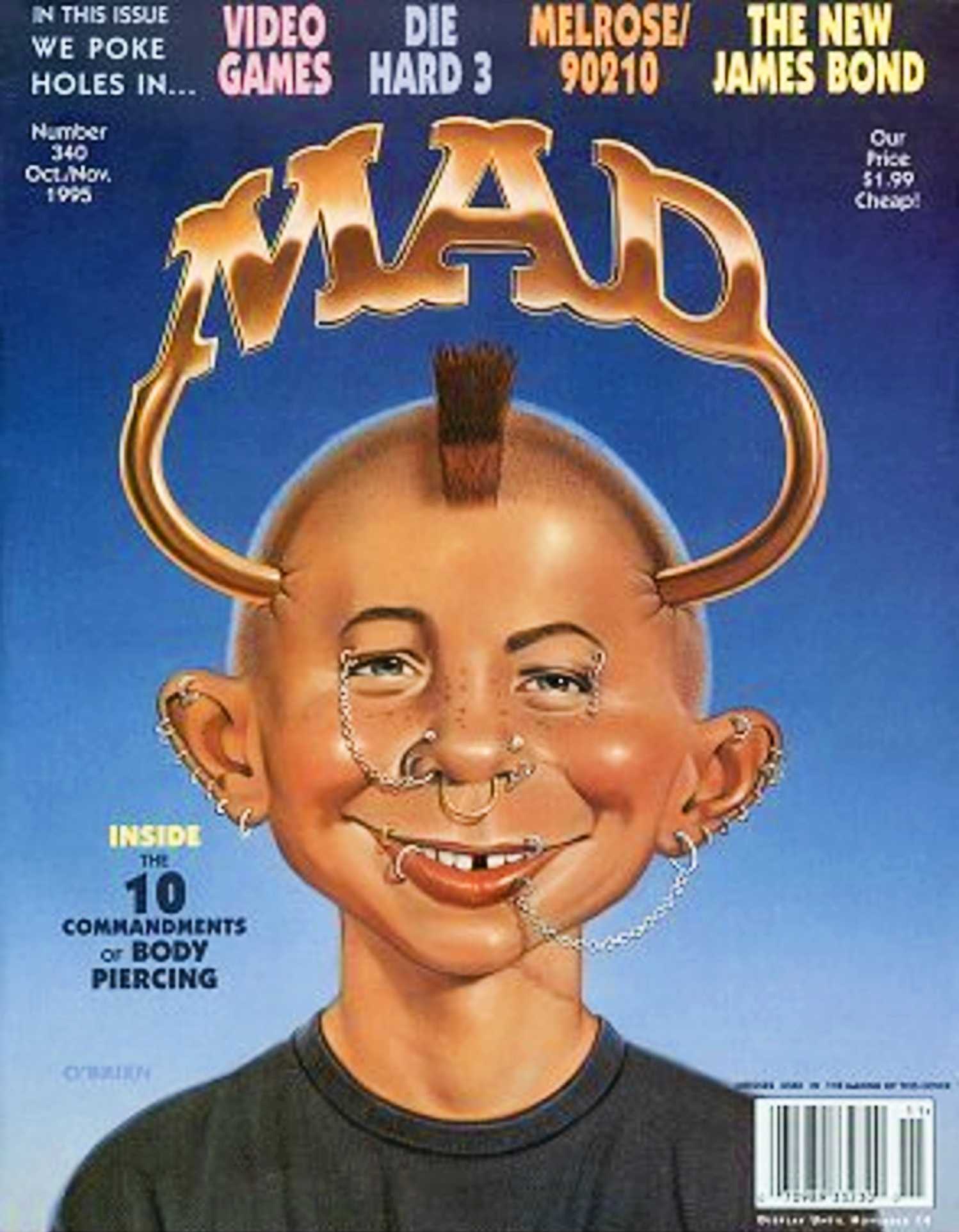
Alfred E. Neuman got a drastic makeover in late 1995, as the cover of Mad #340 turned him into a modern-day teenager. That is, he's got dozens of piercings, sports a mohawk, and wears a black t-shirt. In fact, he's got a ring pierced straight through his head with the words MAD in big gold letters over his dome like a halo. That's hardcore.
By this time, Mad was no longer ahead of the curve when it came to shocking "average" Americans. It had to settle for poking fun at what was. And by the mid-1990s, even punk rock and skater culture had gone mainstream, and facial piercings had started to become sitcom joke fodder. As far as Alfred goes, though, it is a drastic diversion from his usual look, which makes it unforgettable.
1 Mad #416 (April 2002)
Layout By Mad Editorial Staff

Mad #416 was a full-circle moment for the magazine, and for mascot Alfred E. Neuman. 36 years earlier, he'd made his first full appearance on Mad's cover.In 2002, he'd finally become too pricy for the magazine to afford. "We cannot afford the services of mascot Alfred E. Neuman on this cover" a note tacked to a silhouette of Neuman read.
It is another joke at the expense of the economy, and another call to buy "several copies" of the issue to boost its sales. In this way, it evoked some of the greatest Mad covers of earlier decades, and secured itself a spot in the history of the magazine's greatest cover art.




 English (US) ·